
Product Photography Workflow: What to Automate With AI (2026)
By Olga Stogova
10 min read
Cut the product out and place it on a neutral grey ground, in your browser, for free.
Click "Start from a photo" and pick a PNG or JPG of any size. The cutout runs in your browser, so the image is never uploaded to a server.
Grey (#d9d9d9) is already selected once the background is gone. Swap it for any other color with the swatches or the picker.
Download a PNG with the background already composited in, ready for a listing, a deck or an ad.
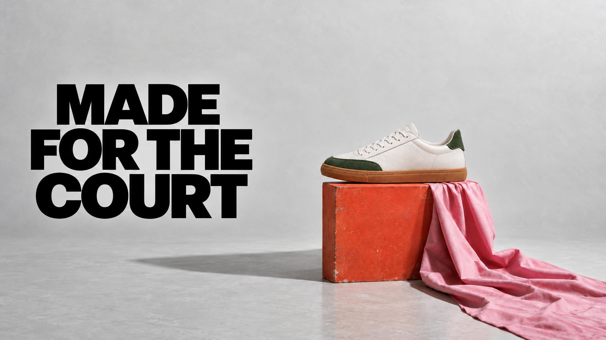
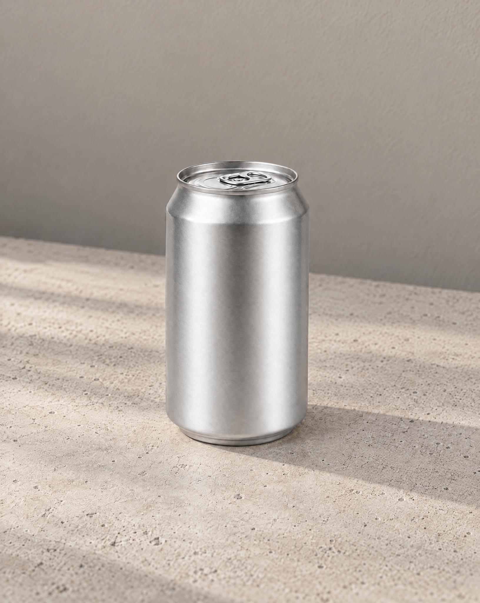
Grey is the compromise a studio reaches after the white shot fails. It is neutral enough not to tint the product and dark enough to keep a white or pale item from dissolving, which is why catalog photography has used a grey sweep for decades.
White, cream and metallic products, editorial catalog grids, and any set where both light and dark items have to look like they were shot in the same room.
It can read as flat and cheap if the product is also mid-toned. When product and ground land at a similar brightness, either lighten the fill or add a shadow so the silhouette has somewhere to sit.
Which grey should I use?
Is grey allowed as a marketplace background?
Why does grey look better than white for my products?
Backgrounds are the easy part
Kive generates the whole product shot — scene, lighting and all — from photos of what you actually sell.