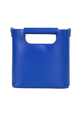
Everything about the color Glaucous
The meaning of the color glaucous and color combinations to inspire your next creation.
Browse images in the color glaucous
What color is glaucous?
Glaucous is a muted, bluish-gray color that often evokes the serene and calming qualities of a misty morning sky. It sits between blue and gray on the color spectrum, offering a soft, understated elegance.
What are similar colors to glaucous?
For variations within the same bluish-gray spectrum as glaucous, consider:
- Periwinkle (#CCCCFF) shares glaucous's soft blue undertones with a hint of purple, offering a more pastel-like appearance.
- Slate (#708090) is darker and more intense, providing a deeper shade that retains the cool, muted characteristics of glaucous.
- Powder Blue (#B0E0E6) is lighter and more vibrant, adding a touch of brightness while maintaining the calmness of glaucous.
What color goes with glaucous?
To complement glaucous's muted tones, consider pairing it with:
- Peach (#FFE5B4) offers a warm, sunny contrast that enhances the coolness of glaucous.
- Sage (#BCB88A) provides a refreshing, green-tinged balance that pairs well with the subtlety of glaucous.
- Lavender (#E6E6FA) adds a touch of elegance with its soothing, purple-tinged hue.
- Mint (#98FF98) offers a crisp, cool contrast that looks good with the muted tones of glaucous.
What color conflicts with glaucous?
To avoid overwhelming the subtlety of glaucous, consider avoiding:
- Black (#000000) can overpower the softness of glaucous.
- White (#FFFFFF) risks washing out the subtle tones of glaucous.
- Gray (#808080) could dull the vibrancy of glaucous.
- Beige (#F5F5DC) may neutralize the coolness of glaucous.
- Cream (#FFFDD0) risks washing out the subtle tones of glaucous.
What does the color glaucous represent?
Glaucous often represents tranquility and calmness, reminiscent of serene water bodies or misty landscapes. It symbolizes introspection and quiet reflection. Psychologically, glaucous can evoke feelings of peace and relaxation, making it a popular choice for spaces meant for unwinding. In art and design, glaucous is used to create a sense of depth and subtle sophistication, often serving as a backdrop that allows other colors to shine.
What's the history of glaucous?
The term "glaucous" originates from the Latin word "glaucus," which means "bluish-gray" or "greenish-blue." Historically, it has been used to describe the natural waxy coating found on certain plants and fruits, giving them a bluish-gray appearance. The color has been referenced in literature and art to evoke the cool, muted tones of nature. In modern times, glaucous is appreciated for its versatility and calming effect, often used in interior design and fashion to create serene and sophisticated environments.
Color Variations
Shades
Tints
Hues
Color Palettes
Monochromatic
Complementary
Analogous
Triadic
Tetradic
Images with glaucous color
Color Conversions
#6082B6rgb(96, 130, 182)rgb(38%, 51%, 71%)47, 29, 0, 29hsl(216, 37%, 55%)216, 47, 71#6082B654, 2, -3121, 22, 4754, 31, 27401100000, 10000010, 10110110Color(red: 0.3764705882352941, green: 0.5098039215686274, blue: 0.7137254901960784)UIColor(red: 0.3764705882352941, green: 0.5098039215686274, blue: 0.7137254901960784, alpha: 1.0)Color(0xFF6082B6)