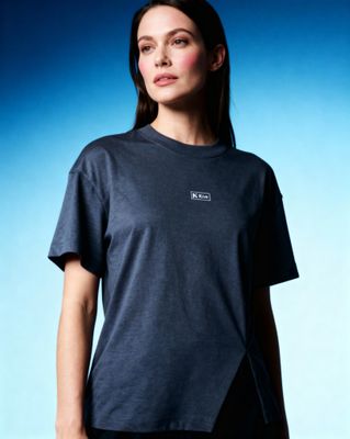
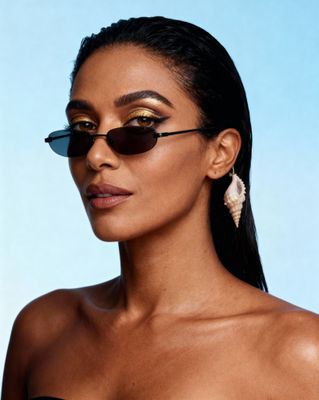
Everything about the color Powder blue
The meaning of the color powder blue and color combinations to inspire your next creation.
Browse images in the color powder blue
What color is powder blue?
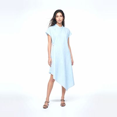
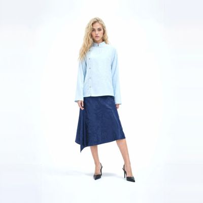
Powder blue is a soft, muted shade of blue that resembles the color of a clear sky on a calm day. It is often associated with tranquility and calmness.
What are similar colors to powder blue?
For variations within the same gentle and soothing spectrum as powder blue, consider:
- Periwinkle (#CCCCFF) shares powder blue's soft, pastel quality with a hint of purple.
- Sky Blue (#87CEEB) is a brighter, more vibrant version of powder blue, evoking clear skies.
- Light Blue (#ADD8E6) offers a similar soft, airy feel with a slightly lighter tone.
- Celeste (#B2FFFF) is a paler, more delicate shade that complements powder blue's gentle nature.
What color goes with powder blue?
To complement powder blue's serene tones, consider pairing it with:
- White (#FFFFFF) enhances powder blue's freshness and purity.
- Peach (#FFE5B4) adds warmth and a gentle contrast to powder blue.
- Lavender (#E6E6FA) provides a soft, harmonious blend with powder blue.
- Mint (#98FF98) offers a refreshing, cool contrast that pairs well with powder blue.
What color conflicts with powder blue?
To avoid clashing with powder blue's soft tones, consider avoiding:
- Burgundy (#800020) can overpower the subtlety of powder blue.
- Black (#000000) may overshadow the lightness of powder blue.
- Dark Brown (#654321) could create a heavy, unbalanced look with powder blue.
- Charcoal (#36454F) might dull the brightness of powder blue.
What does the color powder blue represent?
Powder blue often symbolizes calmness, serenity, and peace, reminiscent of clear skies and gentle seas. It is associated with tranquility and relaxation. Psychologically, powder blue can evoke feelings of trust, reliability, and stability, making it a popular choice in environments aiming to promote calmness. In art and design, powder blue is frequently used to create a soothing atmosphere, often employed in spaces meant for relaxation or reflection. Its gentle hue is also favored in photography and film to convey a sense of innocence or nostalgia.
What's the history of powder blue?
The name "powder blue" originally referred to a type of cobalt glassware in the 17th century, known for its distinctive blue hue. Over time, the term evolved to describe the soft, pastel blue color we recognize today. Powder blue gained popularity in fashion and interior design during the 20th century, often used to evoke a sense of calm and elegance. In modern times, powder blue continues to be a favored choice in various design fields, valued for its soothing and versatile qualities.
Color Variations
Shades
Tints
Hues
Color Palettes
Monochromatic
Complementary
Analogous
Triadic
Tetradic
Images with powder blue color
Color Conversions
#B0E0E6rgb(176, 224, 230)rgb(69%, 88%, 90%)23, 3, 0, 10hsl(187, 52%, 80%)187, 23, 90#B0E0E686, -14, -859, 68, 8586, 16, 21010110000, 11100000, 11100110Color(red: 0.6901960784313725, green: 0.8784313725490196, blue: 0.9019607843137255)UIColor(red: 0.6901960784313725, green: 0.8784313725490196, blue: 0.9019607843137255, alpha: 1.0)Color(0xFFB0E0E6)