Everything about the color Slate
The meaning of the color slate and color combinations to inspire your next creation.
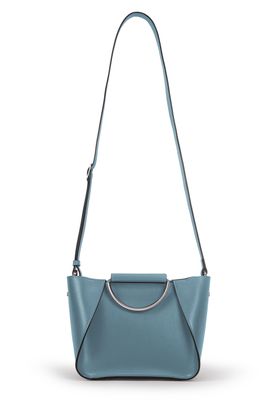
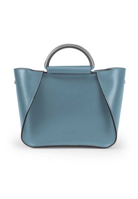
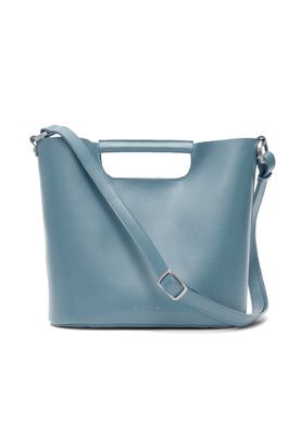
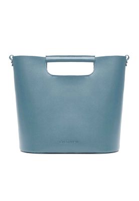
Browse images in the color slate
What color is slate?
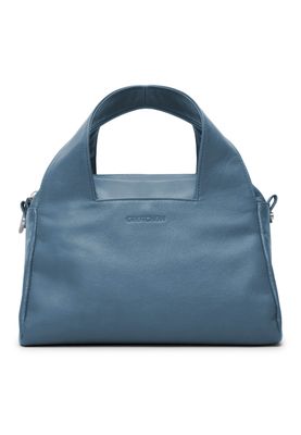
Slate is a medium-dark shade of gray with blue undertones, reminiscent of the natural stone. This color exudes a sense of calm sophistication and can be used to evoke a modern, sleek aesthetic in design.
What are similar colors to slate?
For variations within the same cool and muted spectrum as slate, consider:
- Charcoal (#36454F) shares slate's dark, gray tones but with a slightly more intense, deeper hue.
- Pewter (#96A8A1) offers a lighter, metallic version of slate, with a similar gray-blue vibe.
- Gray (#808080) is a classic neutral that matches slate's gray base but lacks its blue undertones.
- Steel Blue (#4682B4) is a more vibrant, blue-tinged shade that complements slate's subdued elegance.
What color goes with slate?
To complement slate's cool, sophisticated tones, consider pairing it with:
- Ivory (#FFFFF0) provides a soft, warm contrast that highlights slate's depth.
- Sage (#BCB88A) offers a muted green that harmonizes with slate's natural, earthy feel.
- Lavender (#E6E6FA) adds a touch of elegance with its soothing, purple-tinged hue.
- Mint (#98FF98) offers a crisp, cool contrast that looks good with the richness of slate.
What color conflicts with slate?
To avoid clashing with slate's cool, muted tones, consider avoiding:
- Orange (#FFA500) can overpower slate's subtlety with its bold, warm hue.
- Red (#FF0000) risks creating a jarring contrast with slate's cool undertones.
- Yellow (#FFFF00) may clash with slate's sophisticated, subdued palette.
- Pink (#FFC0CB) could overwhelm slate's calm, neutral vibe with its bright, warm tone.
What does the color slate represent?
Slate often symbolizes stability, reliability, and strength, akin to the natural stone it is named after. In psychology, slate is associated with calmness and balance, making it a popular choice for creating serene environments. In art and design, slate is used to convey modernity and sophistication, often serving as a neutral backdrop that enhances other colors. Its subtle elegance makes it a favorite in photography and film for creating a moody or atmospheric effect.
What's the history of slate?
The color slate derives its name from the fine-grained, foliated metamorphic rock of the same name, known for its durability and use in roofing and flooring. The term has been used to describe this particular shade of gray since the 14th century, reflecting its long-standing association with strength and resilience. In modern times, slate has become a popular color in interior design and fashion, valued for its versatility and understated elegance.
Color Variations
Shades
Tints
Hues
Color Palettes
Monochromatic
Complementary
Analogous
Triadic
Tetradic
Images with slate color
Color Conversions
#708090rgb(112, 128, 144)rgb(44%, 50%, 56%)22, 11, 0, 44hsl(210, 13%, 50%)210, 22, 56#70809053, -2, -1119, 21, 2953, 11, 25901110000, 10000000, 10010000Color(red: 0.4392156862745098, green: 0.5019607843137255, blue: 0.5647058823529412)UIColor(red: 0.4392156862745098, green: 0.5019607843137255, blue: 0.5647058823529412, alpha: 1.0)Color(0xFF708090)
