Everything about the color Persimmon
The meaning of the color persimmon and color combinations to inspire your next creation.
Browse images in the color persimmon
What color is persimmon?
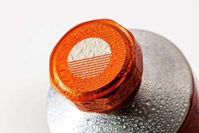
Persimmon is a vibrant, warm shade of orange with a hint of red, reminiscent of the ripe fruit it is named after. This color exudes energy and warmth, often associated with autumn and harvest.
What are similar colors to persimmon?
For variations within the same warm and vibrant spectrum as persimmon, consider:
- Coral (#FF7F50) shares persimmon's lively orange tone but with a softer, pinkish hue, offering a more subdued warmth.
- Vermilion (#E34234) closely resembles persimmon with its bold red-orange blend, providing a striking and energetic presence.
- Burnt Orange (#CC5500) is darker and more intense, offering a deeper shade that retains the vibrant characteristics of persimmon.
- Tangerine (#F28500), while slightly brighter, shares persimmon's warmth and energy, adding a more vivid, sunny edge to the palette.
What color goes with persimmon?
To complement persimmon's vibrant tones, consider pairing it with:
- Teal (#008080) contrasts persimmon's warmth with its cool, calming blue-green hue.
- Sage (#BCB88A) provides a soft, muted green balance that pairs well with the boldness of persimmon.
- Ivory (#FFFFF0) offers a gentle, neutral backdrop that enhances persimmon's vibrant energy.
- Lavender (#E6E6FA) adds a touch of elegance with its soothing, purple-tinged hue.
- Mint (#98FF98) offers a crisp, cool contrast that looks good with the warmth of persimmon.
What color conflicts with persimmon?
To avoid overwhelming the vibrancy of persimmon, consider avoiding:
- Black (#000000) can overpower the brightness of persimmon.
- Gray (#808080) could dull the vibrancy of persimmon.
- Beige (#F5F5DC) may neutralize the intensity of persimmon.
- Cream (#FFFDD0) risks washing out the intensity of persimmon.
- Brown (#A52A2A) might create a heavy, overly warm palette with persimmon.
What does the color persimmon represent?
Persimmon represents warmth, enthusiasm, and creativity, often associated with the vibrant energy of autumn. It evokes feelings of comfort and excitement. Psychologically, persimmon can stimulate conversation and inspire action, making it a great choice for social spaces. In art and design, persimmon adds a dynamic and eye-catching element, often used to draw attention or create a focal point.
What's the history of persimmon?
The color persimmon is named after the fruit of the same name, which is known for its bright orange-red hue. The term has been used to describe this particular shade since the early 20th century, capturing the essence of the fruit's vibrant appearance. Persimmon has been embraced in fashion and design for its bold and cheerful qualities.
In modern use, persimmon is popular in interior design and fashion, where its warm and inviting nature adds a lively touch to various settings.
Color Variations
Shades
Tints
Hues
Color Palettes
Monochromatic
Complementary
Analogous
Triadic
Tetradic
Images with persimmon color
Color Conversions
#EC5800rgb(236, 88, 0)rgb(93%, 35%, 0%)0, 63, 100, 7hsl(22, 100%, 46%)22, 100, 93#EC580057, 54, 6738, 25, 357, 86, 5111101100, 01011000, 00000000Color(red: 0.9254901960784314, green: 0.34509803921568627, blue: 0)UIColor(red: 0.9254901960784314, green: 0.34509803921568627, blue: 0, alpha: 1.0)Color(0xFFEC5800)


