Everything about the color Burnt orange
The meaning of the color burnt orange and color combinations to inspire your next creation.
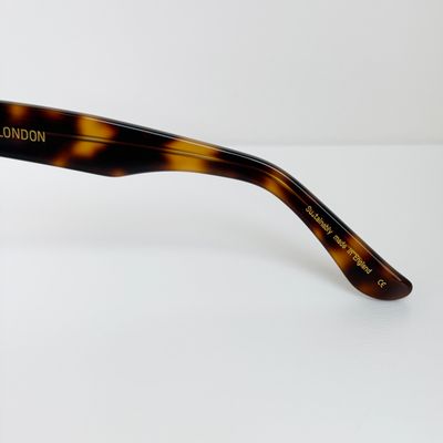
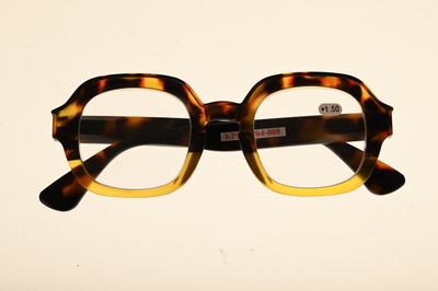
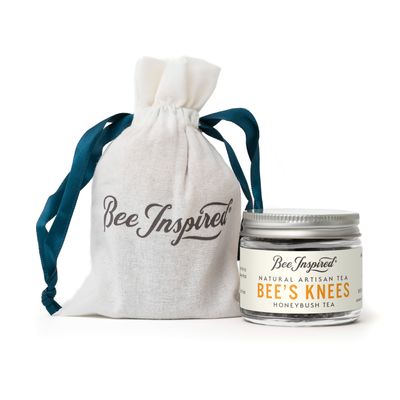
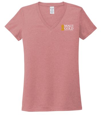
Browse images in the color burnt orange
What color is burnt orange?
Burnt orange is a medium-dark shade of orange with a subtle brown undertone, evoking warmth and a rustic feel.
What are similar colors to burnt orange?
For variations within the same warm and earthy spectrum as burnt orange, consider:
- Amber (#FFBF00) shares burnt orange's warm, golden undertones, offering a brighter, more vibrant alternative.
- Tawny (#CD5700) closely resembles burnt orange with its deep, reddish-brown hue, providing a rich, autumnal feel.
- Terracotta (#E2725B) offers a softer, more muted version of burnt orange with its clay-like, earthy tones.
- Rust (#B7410E) is darker and more intense, providing a deeper shade that retains the warm and inviting characteristics of burnt orange.
What color goes with burnt orange?
To complement burnt orange's warm tones, consider pairing it with:
- Teal (#008080) provides a cool, refreshing contrast that balances burnt orange's warmth.
- Sage (#BCB88A) offers a muted, green-tinged balance that pairs well with the earthy tones of burnt orange.
- Navy (#000080) adds a deep, sophisticated contrast that enhances the richness of burnt orange.
- Ivory (#FFFFF0) softens burnt orange's intensity with its creamy, neutral hue.
What color conflicts with burnt orange?
To avoid clashing with burnt orange's warm tones, consider avoiding:
- Pink (#FFC0CB) can create a jarring contrast with burnt orange's earthy warmth.
- Fuchsia (#FF00FF) may overpower burnt orange with its bright, vivid hue.
- Lavender (#E6E6FA) could clash with burnt orange's warm, earthy tones.
- Gray (#808080) might dull the vibrancy of burnt orange.
What does the color burnt orange represent?
Burnt orange often symbolizes warmth, comfort, and the changing seasons, particularly autumn. It evokes feelings of coziness and nostalgia. Psychologically, burnt orange can stimulate enthusiasm and creativity, while also promoting a sense of stability and reassurance. In art and design, burnt orange is used to create a rustic, inviting atmosphere, often seen in autumn-themed photography and film. Its earthy tones make it a popular choice for interior design, adding warmth and depth to spaces.
What's the history of burnt orange?
The name "burnt orange" originated in the early 20th century, describing a shade of orange that appears as if it has been slightly darkened or "burnt." This color gained popularity in fashion and interior design during the 1970s, reflecting the era's love for earthy, natural hues. In modern times, burnt orange is widely used in branding and design, particularly for its warm, inviting qualities that evoke a sense of comfort and nostalgia.
Color Variations
Shades
Tints
Hues
Color Palettes
Monochromatic
Complementary
Analogous
Triadic
Tetradic
Images with burnt orange color
Color Conversions
#CC5500rgb(204, 85, 0)rgb(80%, 33%, 0%)0, 58, 100, 20hsl(25, 100%, 40%)25, 100, 80#CC550051, 44, 6128, 19, 251, 75, 5411001100, 01010101, 00000000Color(red: 0.8, green: 0.3333333333333333, blue: 0)UIColor(red: 0.8, green: 0.3333333333333333, blue: 0, alpha: 1.0)Color(0xFFCC5500)