Everything about the color Ocre

Ocre is a warm, earthy hue that sits between yellow and orange on the color spectrum. It evokes a sense of natural richness and historical depth.

Click to edit

Browse images in the color ocre

a living room filled with furniture and a chandeliera desk with a lamp and a painting on the walla desk with a lamp and a laptop on ita drawer with a bunch of electronics inside of it

What are similar colors to ocre?

For variations within the same warm and earthy spectrum as ocre, consider:

  • Amber (#FFBF00) shares ocre's warm, golden undertones, offering a brighter, more vibrant alternative.
  • Burnt Orange (#CC5500) closely resembles ocre with its deep, fiery hue, adding a touch of intensity.
  • Terracotta (#E2725B) provides a softer, more muted version of ocre's earthy tones, with a hint of pinkish warmth.

What color goes with ocre?

To complement ocre's warm, earthy tones, consider pairing it with:

  • Teal (#008080) offers a cool, contrasting balance that enhances ocre's warmth.
  • Sage (#BCB88A) provides a gentle, muted green that harmonizes with ocre's natural feel.
  • Lavender (#E6E6FA) adds a soft, soothing contrast to ocre's boldness.
  • Cream (#FFFDD0) enhances ocre's warmth with a subtle, complementary lightness.

What color conflicts with ocre?

To avoid clashing with ocre's warm tones, consider avoiding:

  • Black (#000000) can overpower ocre's subtle warmth.
  • White (#FFFFFF) risks washing out ocre's rich, earthy depth.
  • Gray (#808080) could dull the vibrancy of ocre's warm tones.
  • Blue (#0000FF) may create a stark contrast that conflicts with ocre's natural warmth.

What does the color ocre represent?

Ocre represents warmth, earthiness, and a connection to nature, often associated with historical and cultural richness. It symbolizes stability and reliability. Psychologically, ocre can evoke feelings of comfort and security, providing a grounding effect. It is often used to create a sense of warmth and coziness in spaces. In art, photography, and design, ocre is used to convey a rustic or vintage aesthetic, adding depth and character to compositions.

What's the history of ocre?

The name "ocre" is derived from the Greek word "ochros," meaning pale yellow. Historically, ocre has been used as a pigment in art and decoration since prehistoric times, valued for its natural availability and earthy tones. It was commonly used in ancient cave paintings and by various cultures for its warm, natural hue. In modern times, ocre continues to be popular in design and fashion, appreciated for its timeless and versatile appeal.


Color Variations

Shades

Tints

Hues

Color Palettes

Monochromatic

Complementary

Analogous

Triadic

Tetradic


Images with ocre color


a living room filled with furniture and a chandelier
a desk with a lamp and a painting on the wall
a desk with a lamp and a laptop on it
a drawer with a bunch of electronics inside of it
a white plate topped with meatballs covered in sauce
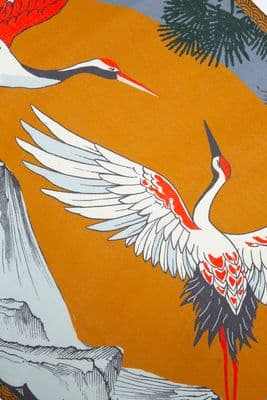
a picture of a bird on a table
a man kicking a soccer ball on top of a field
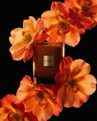
a bottle of perfume surrounded by orange flowers
an orange coat is shown on a white background
a bottle of cantu guava conditioner on a black background
a young man wearing headphones in a gym
a small purse with a bear on it


Color Conversions

HEX
#CC7722
RGB DECIMAL
rgb(204, 119, 34)
RGB PERCENTAGE
rgb(80%, 47%, 13%)
CMYK
0, 42, 83, 20
HSL
hsl(30, 71%, 47%)
HSV (OR HSB)
30, 83, 80
WEB SAFE
#CC7722
CIE-LAB
58, 27, 57
XYZ
32, 26, 5
CIE-LCH
58, 63, 64
BINARY
11001100, 01110111, 00100010
iOS - SwiftUI
Color(red: 0.8, green: 0.4666666666666667, blue: 0.13333333333333333)
iOS - UIKit
UIColor(red: 0.8, green: 0.4666666666666667, blue: 0.13333333333333333, alpha: 1.0)
Android - Compose
Color(0xFFCC7722)


Transform your creative process

Sign up for free and supercharge your creative workflow with Kive.