Everything about the color Oatmeal
The meaning of the color oatmeal and color combinations to inspire your next creation.
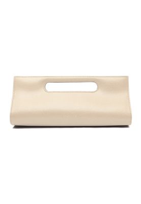
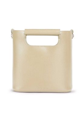
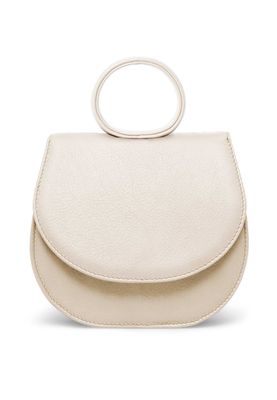
Browse images in the color oatmeal
What color is oatmeal?
Oatmeal is a soft, muted beige tone that resembles the color of ground oats. It is a warm, neutral shade often associated with comfort and simplicity.
What are similar colors to oatmeal?
For variations within the same soft and warm spectrum as oatmeal, consider:
- Beige (#F5F5DC) shares oatmeal's neutral and comforting qualities, offering a slightly lighter and more traditional feel.
- Cream (#FFFDD0) is similar to oatmeal with its warm undertones, providing a softer and more delicate appearance.
- Tan (#D2B48C) resembles oatmeal with its earthy, natural vibe, adding a touch of richness to the palette.
What color goes with oatmeal?
To complement oatmeal's warm and neutral tones, consider pairing it with:
- Sage (#9DC28A) adds a refreshing, green-tinged balance that enhances oatmeal's natural warmth.
- Peach (#FFE5B4) matches with oatmeal's warm, sunny tone and offers a gentle contrast.
- Lavender (#E6E6FA) adds a touch of elegance with its soothing, purple-tinged hue.
What color conflicts with oatmeal?
To avoid overwhelming the subtlety of oatmeal, consider avoiding:
- Black (#000000) can overpower the softness of oatmeal.
- Gray (#808080) could dull the warmth of oatmeal.
- White (#FFFFFF) risks washing out the subtle tones of oatmeal.
What does the color oatmeal represent?
Oatmeal represents simplicity and comfort, often associated with natural and wholesome qualities. It evokes a sense of warmth and coziness, making it a popular choice in home decor. Psychologically, oatmeal is calming and soothing, promoting relaxation and tranquility. It is often used to create a welcoming and peaceful environment. In art and design, oatmeal serves as a versatile background color, providing a neutral base that allows other colors to stand out while maintaining a harmonious balance.
What's the history of oatmeal?
The color oatmeal derives its name from the natural hue of ground oats, a staple food known for its nourishing qualities. Historically, this color has been associated with rustic and rural aesthetics, reflecting the simplicity and practicality of traditional lifestyles. In modern times, oatmeal has become a popular choice in fashion and interior design for its understated elegance and versatility. Its neutral tone makes it suitable for various applications, from clothing to home furnishings, where it provides a timeless and classic appeal.
Color Variations
Shades
Tints
Hues
Color Palettes
Monochromatic
Complementary
Analogous
Triadic
Tetradic
Images with oatmeal color
Color Conversions
#E3D9C6rgb(227, 217, 198)rgb(89%, 85%, 78%)0, 4, 13, 11hsl(39, 34%, 83%)39, 13, 89#E3D9C687, 0, 1167, 70, 6387, 11, 8911100011, 11011001, 11000110Color(red: 0.8901960784313725, green: 0.8509803921568627, blue: 0.7764705882352941)UIColor(red: 0.8901960784313725, green: 0.8509803921568627, blue: 0.7764705882352941, alpha: 1.0)Color(0xFFE3D9C6)
