Everything about the color Manila
The meaning of the color manila and color combinations to inspire your next creation.
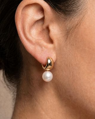
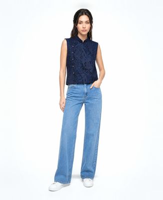
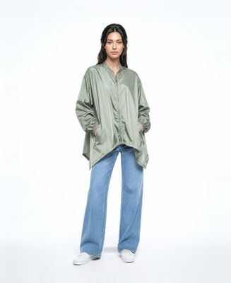
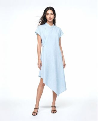
Browse images in the color manila
What color is manila?
Manila is a warm, muted shade of beige with a hint of yellow, reminiscent of the color of manila paper. It evokes a sense of simplicity and natural elegance.
What are similar colors to manila?
For variations within the same warm and neutral spectrum as manila, consider:
- Beige (#F5F5DC) shares manila's soft, neutral tone but with a slightly lighter and more subdued appearance.
- Ivory (#FFFFF0) is similar to manila but offers a lighter, more delicate shade with a subtle warmth.
- Champagne (#F7E7CE) resembles manila with its warm, creamy undertones, adding a touch of sophistication.
- Cream (#FFFDD0) is a lighter, softer version of manila, offering a gentle and inviting feel.
- Tan (#D2B48C) shares manila's earthy warmth but with a slightly darker and more robust hue.
What color goes with manila?
To complement manila's warm and neutral tones, consider pairing it with:
- Sage (#BCB88A) provides a refreshing, green-tinged balance that enhances manila's earthy warmth.
- Peach (#FFE5B4) matches with manila's warm, sunny tone and offers a gentle contrast.
- Lavender (#E6E6FA) adds a touch of elegance with its soothing, purple-tinged hue.
- Mint (#98FF98) offers a crisp, cool contrast that looks good with the warmth of manila.
- Coral (#FF7F50) provides a vibrant, lively contrast that complements manila's subtle tones.
What color conflicts with manila?
To avoid clashing with manila's warm and neutral tones, consider avoiding:
- Black (#000000) can overpower the subtlety of manila.
- Gray (#808080) could dull the warmth of manila.
- Dark Brown (#654321) may create an overly heavy and dated look with manila.
- Olive (#808000) might clash with manila's warm undertones.
- Navy (#000080) can create a stark contrast that detracts from manila's softness.
What does the color manila represent?
Manila represents simplicity, warmth, and natural elegance, often associated with the color of manila paper. It evokes a sense of calm and neutrality. Psychologically, manila can promote feelings of relaxation and comfort, making it a popular choice for creating serene environments. In art and design, manila is often used as a background color to provide a subtle, unobtrusive canvas that highlights other elements. Its understated elegance makes it a versatile choice in photography and film, where it can enhance the natural beauty of a scene.
What's the history of manila?
The color manila is named after manila paper, which originates from the Manila hemp plant, native to the Philippines. This paper was historically used for making sturdy envelopes and folders, giving the color its association with practicality and durability. The warm, muted tone of manila paper became synonymous with the color itself, often used in design and art for its neutral and versatile qualities. In modern times, manila is used in various design contexts, from interior decor to fashion, where its warm neutrality is appreciated for its timeless appeal.
Color Variations
Shades
Tints
Hues
Color Palettes
Monochromatic
Complementary
Analogous
Triadic
Tetradic
Images with manila color
Color Conversions
#E7C9A9rgb(231, 201, 169)rgb(91%, 79%, 66%)0, 13, 27, 9hsl(31, 56%, 78%)31, 27, 91#E7C9A983, 6, 2061, 62, 4683, 21, 7411100111, 11001001, 10101001Color(red: 0.9058823529411765, green: 0.788235294117647, blue: 0.6627450980392157)UIColor(red: 0.9058823529411765, green: 0.788235294117647, blue: 0.6627450980392157, alpha: 1.0)Color(0xFFE7C9A9)