Everything about the color Caramel
The meaning of the color caramel and color combinations to inspire your next creation.
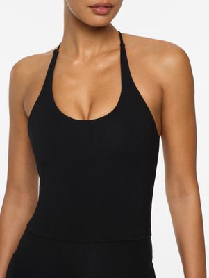
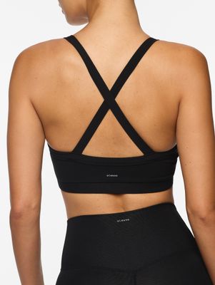
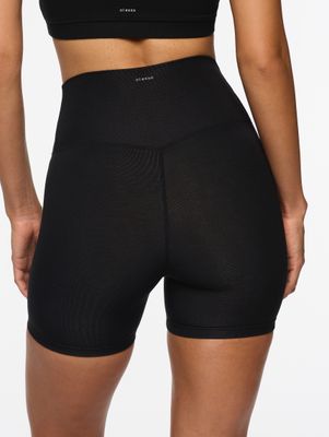
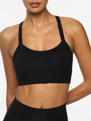
Browse images in the color caramel
What color is caramel?
Caramel is a warm, golden-brown hue reminiscent of the rich, sweet confectionery treat. It evokes warmth and comfort, often associated with autumn and cozy settings.
What are similar colors to caramel?
For variations within the same warm and inviting spectrum as caramel, consider:
- Amber (#FFBF00) shares caramel's golden undertones, offering a slightly brighter and more vibrant appearance.
- Beige (#F5F5DC) is lighter and softer, providing a neutral backdrop similar to caramel's warmth.
- Tan (#D2B48C) is a muted brown that complements caramel's earthy tones with a slightly lighter shade.
- Honey (#FFC30B) has a similar golden warmth, though it is more vibrant and saturated than caramel.
What color goes with caramel?
To complement caramel's warm tones, consider pairing it with:
- Teal (#008080) offers a cool, contrasting hue that enhances caramel's warmth.
- Ivory (#FFFFF0) provides a soft, neutral complement that highlights caramel's richness.
- Sage (#BCB88A) adds a subtle, earthy contrast that pairs well with caramel's natural warmth.
- Lavender (#E6E6FA) introduces a gentle, pastel contrast that brings out caramel's cozy undertones.
What color conflicts with caramel?
To avoid clashing with caramel's warm tones, consider avoiding:
- Black (#000000) can overpower caramel's subtle warmth.
- White (#FFFFFF) risks washing out caramel's rich undertones.
- Gray (#808080) might dull the vibrancy of caramel.
- Cream (#FFFDD0) can blend too closely, losing contrast with caramel.
What does the color caramel represent?
Caramel represents warmth, comfort, and indulgence, often associated with the coziness of autumn and the sweetness of desserts. Psychologically, it evokes feelings of security and homeliness, making it a popular choice for creating inviting spaces. In art and design, caramel is used to add warmth and depth, enhancing the richness of a composition. Its versatility makes it suitable for both modern and traditional aesthetics.
What's the history of caramel?
The color caramel takes its name from the confectionery treat made by heating sugar, which results in a rich, golden-brown hue. This color has been associated with warmth and sweetness, mirroring the characteristics of the treat itself. In modern use, caramel is popular in interior design and fashion, valued for its ability to create cozy, inviting atmospheres.
Color Variations
Shades
Tints
Hues
Color Palettes
Monochromatic
Complementary
Analogous
Triadic
Tetradic
Images with caramel color
Color Conversions
#FFD59Argb(255, 213, 154)rgb(100%, 84%, 60%)0, 16, 40, 0hsl(35, 100%, 80%)35, 40, 100#FFD59A88, 7, 3571, 71, 4188, 35, 7911111111, 11010101, 10011010Color(red: 1, green: 0.8352941176470589, blue: 0.6039215686274509)UIColor(red: 1, green: 0.8352941176470589, blue: 0.6039215686274509, alpha: 1.0)Color(0xFFFFD59A)