Everything about the color Baige
The meaning of the color baige and color combinations to inspire your next creation.
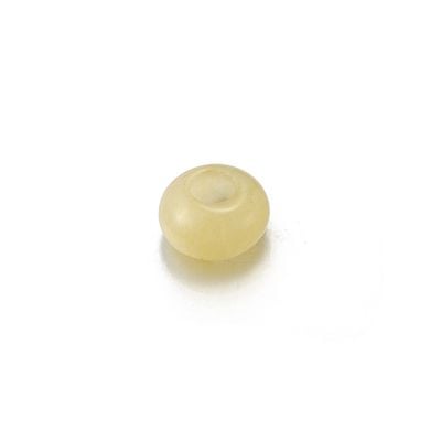
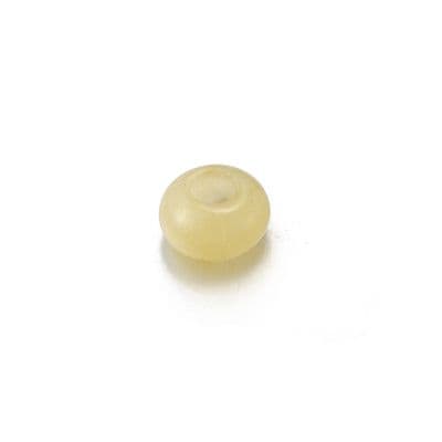
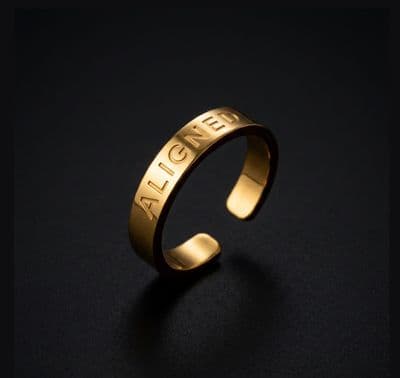
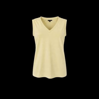
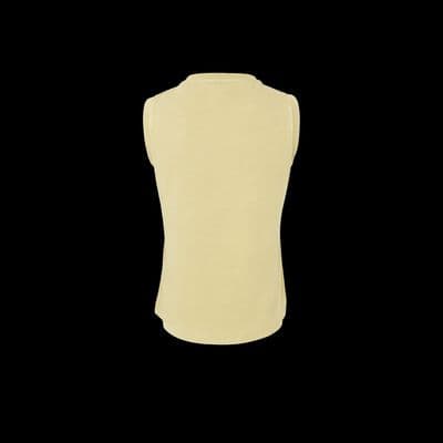
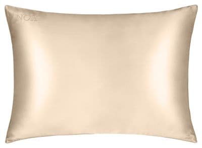
Browse images in the color baige


What color is baige?
Baige is a light, warm, and neutral color that combines the softness of cream with a hint of yellow and brown undertones. It is often associated with natural materials and simplicity.
What are similar colors to baige?
For variations within the same neutral and earthy spectrum as baige, consider:
- Beige (#F5F5DC) shares baige's light, warm tone with a slightly more yellow undertone, offering a classic neutral palette.
- Ivory (#FFFFF0) is similar to baige but with a more subtle, creamy hue, providing a softer, more elegant feel.
- Cream (#FFFDD0) resembles baige with its warm, off-white shade, adding a touch of sophistication to any design.
- Tan (#D2B48C) is a darker, more earthy version of baige, offering a richer, more grounded aesthetic.
What color goes with baige?
To complement baige's warm, neutral tones, consider pairing it with:
- Sage (#BCB88A) offers a gentle, green-tinged balance that enhances the natural warmth of baige.
- Lavender (#E6E6FA) adds a touch of elegance with its soothing, purple-tinged hue.
- Peach (#FFE5B4) matches baige's warm, sunny tone and offers a gentle contrast.
- Mint (#F5FFFA) provides a crisp, cool contrast that looks refreshing with the warmth of baige.
What color conflicts with baige?
To avoid overwhelming the subtlety of baige, consider avoiding:
- Black (#000000) can overpower the lightness of baige.
- White (#FFFFFF) risks washing out the subtle warmth of baige.
- Gray (#808080) could dull the vibrancy and warmth of baige.
- Dark Brown (#A52A2A) may create too stark a contrast with baige's lightness.
What does the color baige represent?
Baige represents simplicity, warmth, and neutrality, often evoking feelings of calmness and relaxation. It is associated with natural materials and environments. Psychologically, baige is seen as a soothing and comforting color, promoting a sense of peace and stability. In art and design, baige is used to create a neutral backdrop that allows other colors to stand out, providing a harmonious and balanced composition.
What's the history of baige?
The name "baige" is derived from the French word for "natural wool," which reflects its origins as a color associated with undyed, natural fibers. Historically, baige has been used in fashion and interior design for its versatility and timeless appeal. In modern times, baige continues to be a popular choice for creating warm, inviting spaces that emphasize simplicity and elegance.
Color Variations
Shades
Tints
Hues
Color Palettes
Monochromatic
Complementary
Analogous
Triadic
Tetradic
Images with baige color


Color Conversions
#F5F5DCrgb(245, 245, 220)rgb(96%, 96%, 86%)0, 0, 10, 4hsl(60, 56%, 91%)60, 10, 96#F5F5DC96, -4, 1283, 90, 8196, 13, 10911110101, 11110101, 11011100Color(red: 0.9607843137254902, green: 0.9607843137254902, blue: 0.8627450980392157)UIColor(red: 0.9607843137254902, green: 0.9607843137254902, blue: 0.8627450980392157, alpha: 1.0)Color(0xFFF5F5DC)