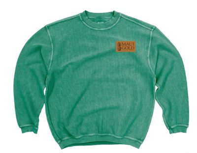
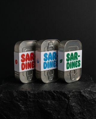
Everything about the color Spruce
The meaning of the color spruce and color combinations to inspire your next creation.
Browse images in the color spruce
What color is spruce?
Spruce is a deep, rich green reminiscent of the lush needles of the spruce tree. It evokes a sense of nature and tranquility, often associated with evergreen forests and the freshness of the outdoors.
What are similar colors to spruce?
For variations within the same deep and natural spectrum as spruce, consider:
- Hunter Green (#355E3B) shares spruce's forest-like quality with a slightly darker tone, enhancing its earthy feel.
- Forest Green (#228B22) closely resembles spruce with its vibrant, lush green hue, reminiscent of dense woodland.
- Evergreen (#05472A) is a darker, more muted shade that retains the natural and calming characteristics of spruce.
What color goes with spruce?
To complement spruce's natural and earthy tones, consider pairing it with:
- Beige (#F5F5DC) offers a soft, neutral contrast that highlights spruce's rich green.
- Cream (#FFFDD0) provides a warm, light balance that enhances the depth of spruce.
- Gold (#FFD700) adds a touch of luxury and warmth, creating a striking contrast with spruce.
- Light Pink (#FFB6C1) introduces a gentle, pastel contrast that softens spruce's intensity.
What color conflicts with spruce?
To avoid clashing with the natural richness of spruce, consider avoiding:
- Red (#FF0000) can create a jarring contrast that overwhelms spruce's natural tones.
- Orange (#FFA500) may clash with spruce's deep green, creating an overly vibrant combination.
- Bright Yellow (#FFEA00) can overpower the subtlety of spruce, leading to a visually overwhelming effect.
What does the color spruce represent?
Spruce represents nature, growth, and renewal, often associated with the evergreen forests and the tranquility of the natural world. Psychologically, it evokes feelings of calmness, stability, and a connection to nature, making it a soothing color choice. In art and design, spruce is used to convey a sense of balance and harmony, often employed in natural-themed compositions and eco-friendly branding.
What's the history of spruce?
The name "spruce" is derived from the spruce tree, a common type of evergreen found in northern temperate and boreal regions. The color captures the essence of the tree's needles, symbolizing nature and endurance. In modern use, spruce is popular in interior design and fashion for its ability to bring a touch of the outdoors inside, creating a serene and grounded atmosphere.
Color Variations
Shades
Tints
Hues
Color Palettes
Monochromatic
Complementary
Analogous
Triadic
Tetradic
Images with spruce color
Color Conversions
#0A5F38rgb(10, 95, 56)rgb(4%, 37%, 22%)89, 0, 41, 63hsl(152, 81%, 21%)152, 89, 37#0A5F3835, -34, 165, 9, 535, 37, 15500001010, 01011111, 00111000Color(red: 0.0392156862745098, green: 0.37254901960784315, blue: 0.2196078431372549)UIColor(red: 0.0392156862745098, green: 0.37254901960784315, blue: 0.2196078431372549, alpha: 1.0)Color(0xFF0A5F38)