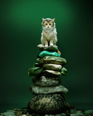
Everything about the color Spearmint
The meaning of the color spearmint and color combinations to inspire your next creation.
Browse images in the color spearmint
What color is spearmint?
Spearmint is a refreshing, cool shade of green with a hint of blue, reminiscent of mint leaves. It evokes a sense of freshness and vitality.
What are similar colors to spearmint?
For variations within the same fresh and vibrant spectrum as spearmint, consider:
- Mint (#98FF98) shares spearmint's refreshing green quality but is lighter and more pastel.
- Turquoise (#40E0D0) offers a similar cool tone with a more pronounced blue undertone.
- Seafoam (#93E9BE) is a softer, more muted version of spearmint, maintaining the cool, calming vibe.
- Aquamarine (#7FFFD4) has a similar green-blue balance but with a brighter, more vibrant appearance.
What color goes with spearmint?
To complement spearmint's refreshing tones, consider pairing it with:
- Coral (#FF7F50) provides a warm, energetic contrast that enhances spearmint's coolness.
- Lavender (#E6E6FA) adds a soft, elegant touch that balances spearmint's freshness.
- Peach (#FFE5B4) offers a gentle, warm contrast that complements spearmint's cool hue.
- Ivory (#FFFFF0) provides a neutral, soft backdrop that highlights spearmint's vibrant qualities.
- Navy (#000080) creates a bold, sophisticated contrast that enhances spearmint's brightness.
What color conflicts with spearmint?
To avoid clashing with spearmint's fresh tones, consider avoiding:
- Burgundy (#800020) can overpower spearmint with its deep, rich hue.
- Maroon (#800000) risks overshadowing spearmint's lightness with its dark, intense tone.
- Brown (#A52A2A) may dull the vibrancy of spearmint.
- Black (#000000) can create too stark a contrast, overwhelming spearmint's subtlety.
- Dark Gray (#A9A9A9) could neutralize the refreshing quality of spearmint.
What does the color spearmint represent?
Spearmint represents freshness, renewal, and a sense of calm, often associated with nature and tranquility. It is a color that evokes feelings of relaxation and rejuvenation. Psychologically, spearmint is thought to promote clarity and creativity, helping to clear the mind and inspire new ideas. In art, photography, and design, spearmint is used to create a serene, inviting atmosphere, often employed in spaces meant for relaxation or reflection.
What's the history of spearmint?
The color spearmint takes its name from the spearmint plant, known for its aromatic leaves and refreshing scent. Historically, spearmint has been used in culinary and medicinal applications, its vibrant green hue symbolizing health and vitality. The color itself became popular in design and fashion as a representation of freshness and modernity. In modern times, spearmint is often used in branding and interior design to evoke a sense of calm and rejuvenation, making it a popular choice for wellness and lifestyle brands.
Color Variations
Shades
Tints
Hues
Color Palettes
Monochromatic
Complementary
Analogous
Triadic
Tetradic
Images with spearmint color
Color Conversions
#4DBE8Ergb(77, 190, 142)rgb(30%, 75%, 56%)59, 0, 25, 25hsl(155, 47%, 52%)155, 59, 75#4DBE8E70, -43, 1526, 40, 3270, 46, 16101001101, 10111110, 10001110Color(red: 0.30196078431372547, green: 0.7450980392156863, blue: 0.5568627450980392)UIColor(red: 0.30196078431372547, green: 0.7450980392156863, blue: 0.5568627450980392, alpha: 1.0)Color(0xFF4DBE8E)


