Everything about the color Serenity
The meaning of the color serenity and color combinations to inspire your next creation.
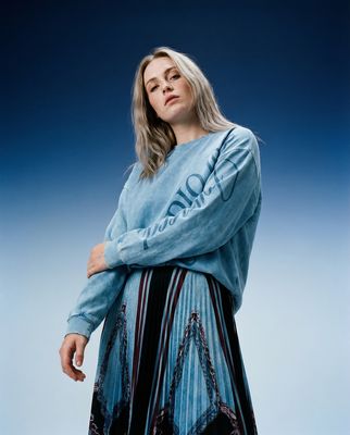
Browse images in the color serenity
What color is serenity?
Serenity is a tranquil, soft blue shade with a hint of lavender, evoking a sense of calm and peace. It sits between blue and purple on the color spectrum, offering a soothing and serene visual experience.
What are similar colors to serenity?
For variations within the same calming and gentle spectrum as serenity, consider:
- Periwinkle (#CCCCFF) shares serenity's soothing blue-lavender blend, offering a slightly lighter and more pastel appearance.
- Lavender (#E6E6FA) closely resembles serenity with its soft purple tones, providing a similarly calming and gentle effect.
- Light blue (#ADD8E6) offers a cooler, more straightforward blue tone, maintaining serenity's peaceful and airy qualities.
What color goes with serenity?
To complement serenity's tranquil tones, consider pairing it with:
- Peach (#FFE5B4) adds a warm, soft contrast that enhances serenity's coolness.
- Sage (#BCB88A) provides a muted, earthy balance that complements serenity's soothing nature.
- Mint (#98FF98) offers a fresh, crisp contrast that pairs well with serenity's calming blue undertones.
- Ivory (#FFFFF0) introduces a subtle, neutral backdrop that highlights serenity's gentle hue.
- Blush (#DE5D83) adds a soft, warm touch that contrasts beautifully with serenity's cool tones.
What color conflicts with serenity?
To avoid clashing with serenity's calming nature, consider avoiding:
- Bright red (#FF0000) can overpower serenity's subtlety with its intense vibrancy.
- Orange (#FFA500) may create a jarring contrast against serenity's soft, cool tones.
- Yellow (#FFFF00) risks overwhelming serenity's tranquil essence with its brightness.
- Black (#000000) can overshadow serenity's light and airy feel.
- Dark brown (#654321) may dull serenity's gentle and soothing effect.
What does the color serenity represent?
Serenity symbolizes tranquility, calmness, and peace, often associated with quiet moments and a sense of relaxation. Psychologically, it can evoke feelings of safety and stability, helping to reduce stress and promote mental clarity. In art, photography, and design, serenity is used to create a calming atmosphere, often serving as a backdrop to enhance other elements without overwhelming them.
What's the history of serenity?
The name "serenity" comes from the Latin word "serenus," meaning clear or calm, reflecting its tranquil nature. It gained popularity as a color name in the 20th century, often used to describe peaceful blue hues. In modern times, serenity has been embraced in various design fields for its soothing qualities, often paired with other soft tones to create harmonious palettes.
Color Variations
Shades
Tints
Hues
Color Palettes
Monochromatic
Complementary
Analogous
Triadic
Tetradic
Images with serenity color
Color Conversions
#92A8D1rgb(146, 168, 209)rgb(57%, 66%, 82%)30, 20, 0, 18hsl(219, 41%, 70%)219, 30, 82#92A8D169, 2, -2337, 39, 6669, 23, 27510010010, 10101000, 11010001Color(red: 0.5725490196078431, green: 0.6588235294117647, blue: 0.8196078431372549)UIColor(red: 0.5725490196078431, green: 0.6588235294117647, blue: 0.8196078431372549, alpha: 1.0)Color(0xFF92A8D1)


