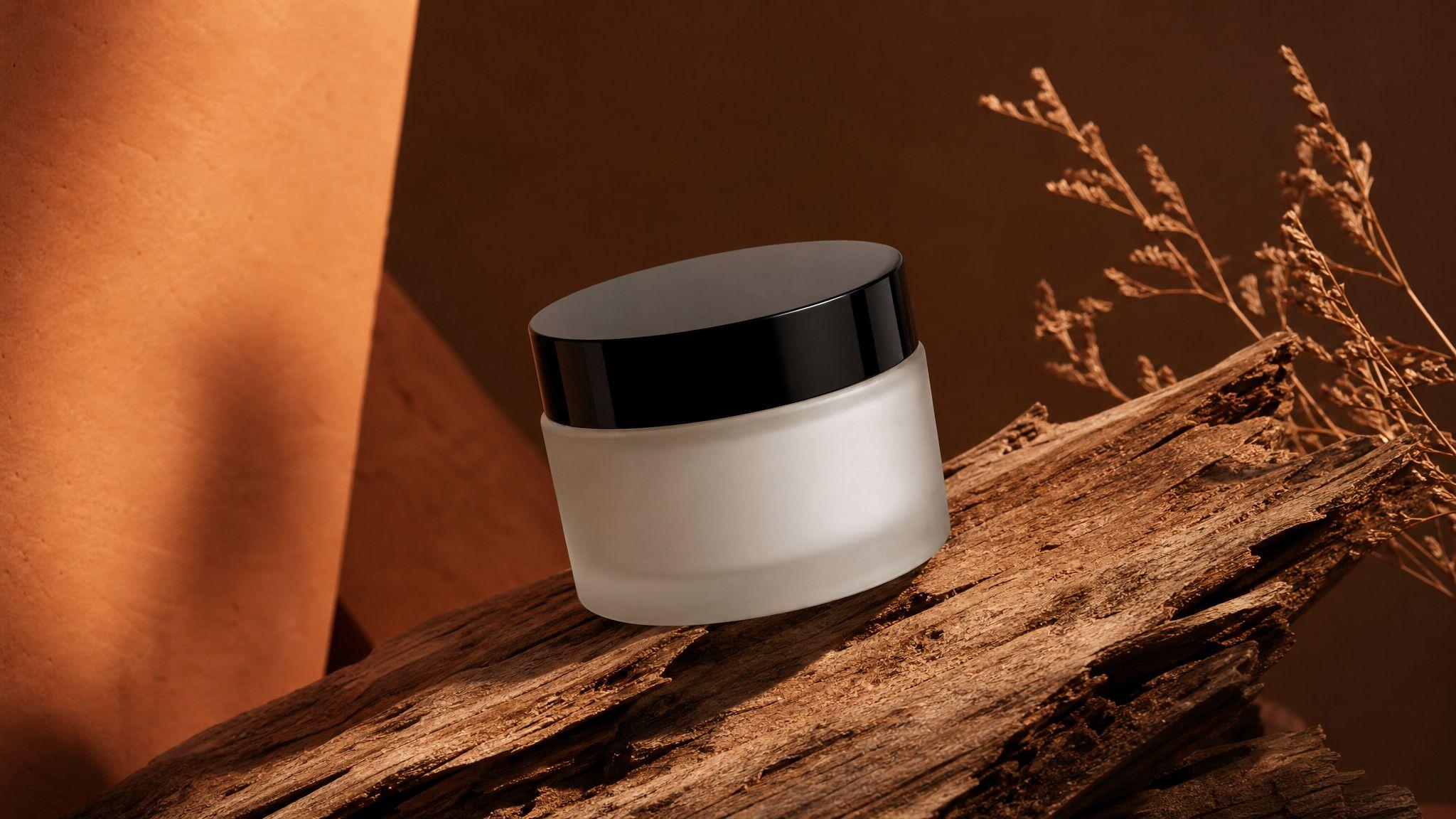
Brand Color Accuracy in Product Photography: 2026 Guide
By Olga Stogova
11 min read
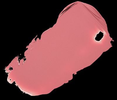
Puce is a muted, brownish-pink color that sits between pink and brown on the color wheel. It evokes a vintage, antique feel and is often associated with subtle elegance and sophistication.



For variations within the same muted and vintage spectrum as puce, consider:
To complement puce's vintage and muted tones, consider pairing it with:
To avoid clashing with puce's muted elegance, consider avoiding:
Puce often symbolizes sophistication and understated elegance, evoking a sense of nostalgia and vintage charm. In color psychology, puce can represent stability and reliability, offering a calming and reassuring presence. In art and design, puce is used to create a sense of warmth and subtlety, often adding depth and a touch of vintage allure to compositions.
The name "puce" comes from the French word for "flea," as the color is said to resemble the bloodstains left by fleas on linen. It gained popularity in the 18th century, particularly in France, where it was favored by Marie Antoinette. In modern times, puce is used in fashion and interior design to convey a sense of vintage elegance and sophistication.

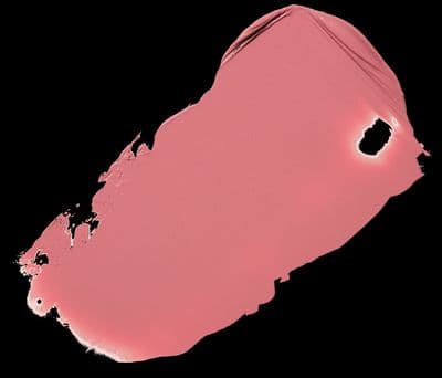





#CC8899rgb(204, 136, 153)rgb(80%, 53%, 60%)0, 33, 25, 20hsl(345, 40%, 67%)345, 33, 80#CC889964, 28, 239, 33, 3464, 28, 311001100, 10001000, 10011001Color(red: 0.8, green: 0.5333333333333333, blue: 0.6)UIColor(red: 0.8, green: 0.5333333333333333, blue: 0.6, alpha: 1.0)Color(0xFFCC8899)Transform your creative process
Sign up for free and supercharge your creative workflow with Kive.