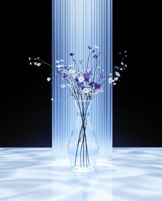
Everything about the color Periwinkle blue
The meaning of the color periwinkle blue and color combinations to inspire your next creation.
Browse images in the color periwinkle blue
What color is periwinkle blue?
Periwinkle blue is a soft, pastel shade that blends blue and violet hues, reminiscent of the periwinkle flower. It evokes a sense of calmness and serenity.
What are similar colors to periwinkle blue?
For variations close to periwinkle blue, consider:
- Periwinkle (#CCCCFF) is nearly identical, offering the same calming blend of blue and violet.
- Lavender (#E6E6FA) shares a similar lightness and purple undertone, adding a floral touch to the palette.
- Lilac (#C8A2C8) offers a slightly pinker hue, maintaining the soft and delicate feel.
- Mauve (#E0B0FF) provides a more muted purple tone, still within the gentle pastel spectrum.
What color goes with periwinkle blue?
To complement periwinkle blue's gentle tones, consider pairing it with:
- Peach (#FFE5B4) adds warmth and a soft contrast to periwinkle's coolness.
- Sage (#9DC28A) offers a muted green that balances periwinkle's pastel nature.
- Mint (#F5FFFA) provides a fresh, cool contrast that enhances periwinkle's soothing qualities.
- Light pink (#FFD1DC) complements with its soft, romantic hue, enhancing the gentle vibe.
- Ivory (#FFFFF0) adds a neutral, elegant touch that pairs well with periwinkle's subtlety.
What color conflicts with periwinkle blue?
To avoid clashing with periwinkle blue, consider avoiding:
- Black (#000000) can overpower the delicate nature of periwinkle.
- Dark brown (#654321) may create too stark a contrast, overshadowing periwinkle's softness.
- Olive (#808000) could introduce a muddy tone that conflicts with periwinkle's clarity.
- Red (#FF0000) is too bold and vibrant, potentially clashing with periwinkle's calmness.
- Orange (#FFA500) might be too intense, disrupting the serene effect of periwinkle.
What does the color periwinkle blue represent?
Periwinkle blue often symbolizes tranquility and peace, reminiscent of serene skies and calm waters. It is associated with youthfulness and innocence. Psychologically, it can evoke feelings of relaxation and reduce stress, making it a popular choice for calming spaces. In art and design, periwinkle blue is used to create a sense of space and openness, often employed in backgrounds to enhance focus on the main subject. Its gentle hue is favored in photography and film for its ability to convey subtle emotion and depth.
What's the history of periwinkle blue?
The name "periwinkle blue" is derived from the periwinkle flower, known for its delicate blue-violet petals. The color has been used since the early 20th century, gaining popularity for its soothing and versatile qualities. In modern times, periwinkle blue is widely used in fashion, interior design, and digital media for its calming effect and aesthetic appeal.
Color Variations
Shades
Tints
Hues
Color Palettes
Monochromatic
Complementary
Analogous
Triadic
Tetradic
Images with periwinkle blue color
Color Conversions
#CCCCFFrgb(204, 204, 255)rgb(80%, 80%, 100%)20, 20, 0, 0hsl(240, 100%, 90%)240, 20, 100#CCCCFF84, 10, -2565, 63, 10084, 27, 29211001100, 11001100, 11111111Color(red: 0.8, green: 0.8, blue: 1)UIColor(red: 0.8, green: 0.8, blue: 1, alpha: 1.0)Color(0xFFCCCCFF)