Everything about the color Pastel
The meaning of the color pastel and color combinations to inspire your next creation.
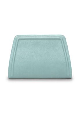
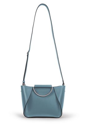
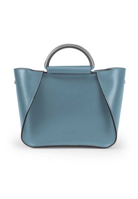
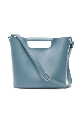
Browse images in the color pastel
What color is pastel?
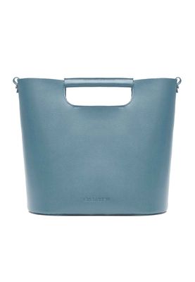
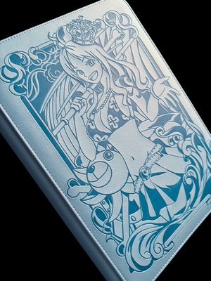
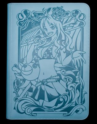
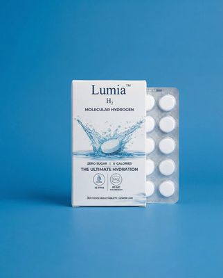
Pastel is a soft, muted color that often evokes a sense of calmness and tranquility. It is typically a pale shade that can be found in various hues, such as pink, blue, or green, each offering a gentle, soothing presence.
What are similar colors to pastel?
For variations within the same soft and muted spectrum as pastel, consider:
- Periwinkle (#CCCCFF) shares pastel's gentle and calming qualities with a hint of blue.
- Lavender (#E6E6FA) offers a similar soft, soothing presence with a touch of purple.
- Mauve (#E0B0FF) has a comparable muted tone with a slightly pinkish hue.
- Lilac (#C8A2C8) mirrors pastel's soft and delicate nature with a light purple tint.
- Mint (#98FF98) provides a fresh, cool variation within the pastel palette.
What color goes with pastel?
To complement pastel's soft and muted tones, consider pairing it with:
- Light pink (#FFB6C1) enhances the gentle quality of pastel with its soft, romantic hue.
- Peach (#FFE5B4) offers a warm, sunny contrast that pairs well with pastel's coolness.
- Sage (#9DC28A) provides a refreshing, green-tinged balance that complements pastel's softness.
- Lavender (#E6E6FA) adds a touch of elegance with its soothing, purple-tinged hue.
- Mint (#F5FFFA) offers a crisp, cool contrast that looks good with the softness of pastel.
What color conflicts with pastel?
To avoid overwhelming the softness of pastel, consider avoiding:
- Black (#000000) can overpower the gentle nature of pastel.
- Gray (#808080) could dull the vibrancy of pastel.
- Beige (#F5F5DC) may neutralize the subtlety of pastel.
- Cream (#FFFDD0) risks washing out the delicacy of pastel.
- Brown (#A52A2A) can overshadow the lightness of pastel.
What does the color pastel represent?
Pastel colors often symbolize calmness, peace, and serenity, making them ideal for creating a tranquil atmosphere. They are associated with innocence and youthfulness, evoking feelings of nostalgia and simplicity. In psychology, pastels are known to reduce stress and promote relaxation, often used in therapeutic settings to create a soothing environment. In art and design, pastels are favored for their ability to convey subtlety and elegance, often used to create soft, dreamy visuals that are easy on the eyes.
What's the history of pastel?
The term "pastel" originates from the Latin word "pastellus," referring to the soft, chalky sticks used by artists. These colors gained popularity in the 18th century, particularly in Rococo art, known for its light, airy compositions. Pastels were favored for their ability to blend seamlessly and create delicate, nuanced works. In modern times, pastel colors are widely used in fashion, interior design, and branding to convey a sense of calm and sophistication.
Color Variations
Shades
Tints
Hues
Color Palettes
Monochromatic
Complementary
Analogous
Triadic
Tetradic
Images with pastel color
Color Conversions
#AEC6CFrgb(174, 198, 207)rgb(68%, 78%, 81%)16, 4, 0, 19hsl(196, 26%, 75%)196, 16, 81#AEC6CF78, -6, -749, 54, 6778, 10, 22910101110, 11000110, 11001111Color(red: 0.6823529411764706, green: 0.7764705882352941, blue: 0.8117647058823529)UIColor(red: 0.6823529411764706, green: 0.7764705882352941, blue: 0.8117647058823529, alpha: 1.0)Color(0xFFAEC6CF)