Everything about the color Parchment
The meaning of the color parchment and color combinations to inspire your next creation.
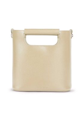
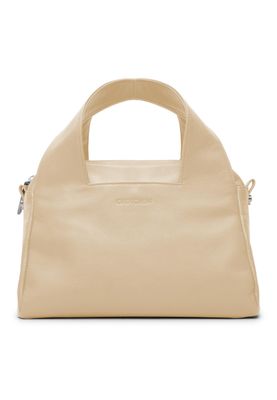
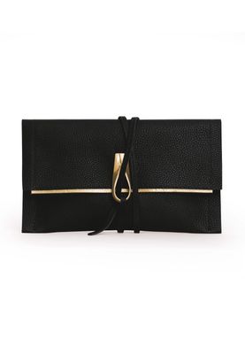
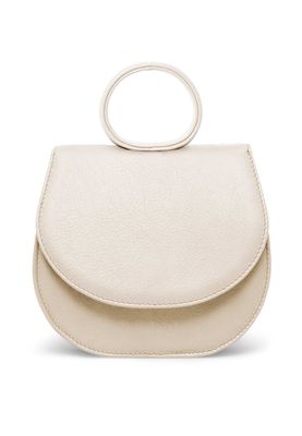
Browse images in the color parchment
What color is parchment?
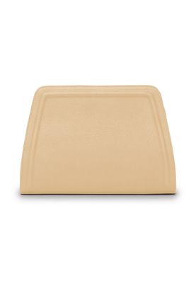
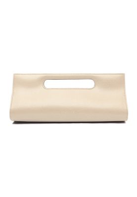
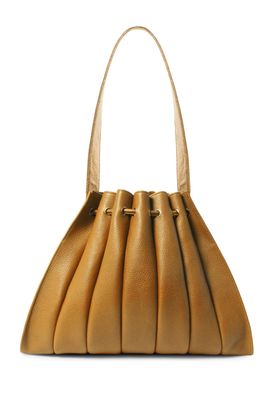
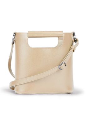
Parchment is a warm, creamy off-white color that resembles the look of aged paper. It evokes a sense of antiquity and subtle elegance.
What are similar colors to parchment?
For variations within the same warm and neutral spectrum as parchment, consider:
- Beige (#F5F5DC) shares parchment's soft, neutral tone with a slightly more yellow undertone, offering a classic and versatile look.
- Ivory (#FFFFF0) is similar to parchment with its creamy, off-white hue, providing a touch of sophistication and warmth.
- Cream (#FFFDD0) closely resembles parchment with its pale, yellowish tint, adding a gentle and inviting aesthetic.
- Champagne (#F7E7CE) offers a similar light, neutral shade with a hint of pinkish warmth, creating a refined and elegant feel.
What color goes with parchment?
To complement parchment's warm, neutral tones, consider pairing it with:
- Sage (#BCB88A) provides a soft, muted green that enhances the natural warmth of parchment.
- Peach (#FFE5B4) matches with parchment's warm undertones, offering a gentle, harmonious contrast.
- Lavender (#E6E6FA) adds a subtle touch of coolness and sophistication to the warmth of parchment.
- Mint (#98FF98) offers a fresh, cool contrast that pairs well with parchment's creamy warmth.
- Light pink (#FFB6C1) complements parchment's warmth with its soft, delicate hue.
What color conflicts with parchment?
To avoid clashing with parchment's warm, neutral tones, consider avoiding:
- Black (#000000) can create too stark a contrast with parchment's subtle warmth.
- Gray (#808080) could dull the inviting warmth of parchment.
- White (#FFFFFF) risks washing out the gentle tones of parchment.
- Taupe (#483C32) may neutralize the warmth of parchment, leading to a less vibrant palette.
- Charcoal (#36454F) can overpower the softness of parchment with its dark, intense hue.
What does the color parchment represent?
Parchment represents timelessness and tradition, often evoking the image of ancient manuscripts and historical documents. It symbolizes wisdom and a connection to the past. Psychologically, parchment is calming and comforting, offering a sense of stability and reliability. It can evoke feelings of nostalgia and warmth. In art, photography, and design, parchment is used to create a vintage or classic aesthetic, adding depth and character to compositions. It is often chosen for its ability to convey elegance and understated sophistication.
What's the history of parchment?
The color parchment derives its name from the material used historically for writing, made from animal skin. This material was widely used in ancient times for important documents and manuscripts, giving the color its association with antiquity and tradition. The warm, creamy hue of parchment reflects the natural tones of aged paper. In modern times, the color is used in design and decor to evoke a sense of history and elegance, often chosen for its ability to create a classic and timeless look.
Color Variations
Shades
Tints
Hues
Color Palettes
Monochromatic
Complementary
Analogous
Triadic
Tetradic
Images with parchment color
Color Conversions
#F1E9D2rgb(241, 233, 210)rgb(95%, 91%, 82%)0, 3, 13, 5hsl(45, 53%, 88%)45, 13, 95#F1E9D292, -1, 1277, 82, 7392, 12, 9511110001, 11101001, 11010010Color(red: 0.9450980392156862, green: 0.9137254901960784, blue: 0.8235294117647058)UIColor(red: 0.9450980392156862, green: 0.9137254901960784, blue: 0.8235294117647058, alpha: 1.0)Color(0xFFF1E9D2)
