Everything about the color Matcha
The meaning of the color matcha and color combinations to inspire your next creation.
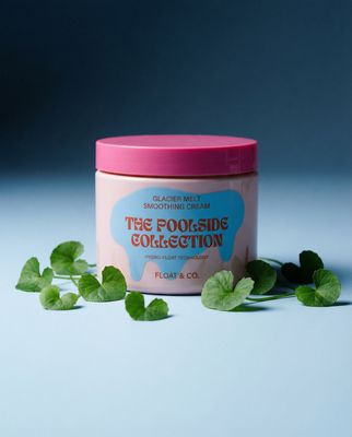
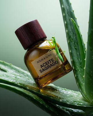
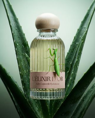
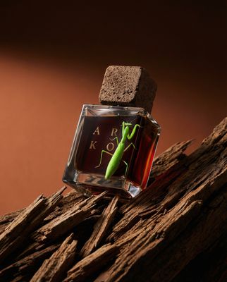
Browse images in the color matcha
What color is matcha?
Matcha is a soft, muted green that resembles the vibrant hue of powdered green tea leaves. It evokes a sense of calm and natural freshness.
What are similar colors to matcha?
For variations within the same green spectrum as matcha, consider:
- Sage (#BCB88A) shares matcha's earthy tone with a slightly more muted, grayish undertone.
- Mint (#98FF98) offers a brighter, more pastel version of matcha's green.
- Olive (#808000) is darker and more subdued, providing a deeper, more robust green.
- Celadon (#ACE1AF) has a similar soft green tone but with a hint of blue, giving it a cooler appearance.
- Pistachio (#93C572) is a lighter, more pastel green that maintains matcha's fresh, natural vibe.
What color goes with matcha?
To complement matcha's soothing tones, consider pairing it with:
- Peach (#FFE5B4) provides a warm, soft contrast that enhances matcha's natural freshness.
- Lavender (#E6E6FA) adds a touch of elegance with its soothing, purple-tinged hue.
- Cream (#FFFDD0) offers a gentle, neutral balance that highlights matcha's subtle vibrancy.
- Coral (#FF7F50) introduces a lively, warm contrast that energizes matcha's calmness.
- Ivory (#FFFFF0) provides a soft, neutral backdrop that complements matcha's earthy tones.
What color conflicts with matcha?
To avoid clashing with matcha's natural tones, consider avoiding:
- Black (#000000) can overpower matcha's subtlety.
- Gray (#808080) might dull matcha's natural vibrancy.
- Dark brown (#654321) could overshadow matcha's fresh, light quality.
- Navy (#000080) is too dark and intense, conflicting with matcha's soft green.
- Burgundy (#800020) may create a jarring contrast with matcha's gentle hue.
What does the color matcha represent?
Matcha represents tranquility and a connection to nature, often associated with health and wellness due to its origin in green tea. Psychologically, matcha evokes calmness and relaxation, promoting a sense of balance and renewal. In art and design, matcha is used to convey freshness and a grounded, organic aesthetic, often seen in eco-friendly and minimalist designs. Its soothing green hue is popular in photography and film to create serene, peaceful scenes.
What's the history of matcha?
The color matcha derives its name from the finely ground powder of specially grown and processed green tea leaves, originating from Japan. Traditionally used in Japanese tea ceremonies, matcha has become popular worldwide for its health benefits and unique flavor. The color itself has gained recognition in design and fashion, symbolizing a connection to nature and wellness. In modern use, matcha is celebrated for its calming and refreshing qualities, often featured in lifestyle and wellness branding.
Color Variations
Shades
Tints
Hues
Color Palettes
Monochromatic
Complementary
Analogous
Triadic
Tetradic
Images with matcha color
Color Conversions
#74A662rgb(116, 166, 98)rgb(45%, 65%, 38%)30, 0, 41, 35hsl(104, 28%, 52%)104, 41, 65#74A66263, -30, 3023, 32, 1663, 42, 13501110100, 10100110, 01100010Color(red: 0.4549019607843137, green: 0.6509803921568628, blue: 0.3843137254901961)UIColor(red: 0.4549019607843137, green: 0.6509803921568628, blue: 0.3843137254901961, alpha: 1.0)Color(0xFF74A662)