Everything about the color Jasmine
The meaning of the color jasmine and color combinations to inspire your next creation.
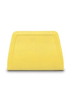
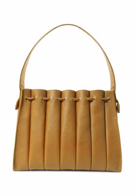
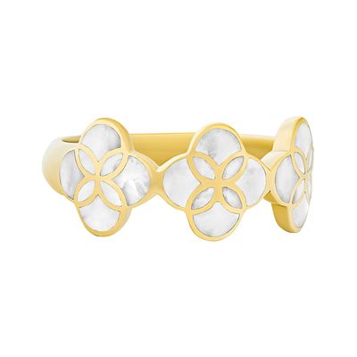
Browse images in the color jasmine
What color is jasmine?
Jasmine is a soft, warm yellow with a hint of cream, reminiscent of the delicate petals of the jasmine flower. It exudes a gentle, calming presence.
What are similar colors to jasmine?
For variations within the same light and warm spectrum as jasmine, consider:
- Ivory (#FFFFF0) shares jasmine's soft, creamy undertones, offering a similarly gentle and soothing appearance.
- Cream (#FFFDD0) closely resembles jasmine with its warm, pale yellow hue, evoking a sense of comfort and elegance.
- Beige (#F5F5DC) offers a slightly darker, more neutral tone while maintaining the warmth and subtlety of jasmine.
What color goes with jasmine?
To complement jasmine's warm and gentle tones, consider pairing it with:
- Lavender (#E6E6FA) adds a touch of elegance with its soothing, purple-tinged hue, creating a harmonious balance.
- Sage (#9DC28A) provides a refreshing, green-tinged balance that pairs well with the softness of jasmine.
- Peach (#FFE5B4) matches with jasmine's warm, sunny tone and offers a gentle contrast.
What color conflicts with jasmine?
To avoid overwhelming the softness of jasmine, consider avoiding:
- Black (#000000) can overpower the lightness of jasmine.
- Gray (#808080) could dull the vibrancy of jasmine.
- Dark purple (#301934) may create too stark a contrast with jasmine's warmth.
What does the color jasmine represent?
Jasmine represents purity and simplicity, often associated with the delicate beauty of the jasmine flower. It symbolizes warmth and positivity, bringing a sense of calm and relaxation. In color psychology, jasmine is believed to evoke feelings of happiness and optimism, promoting a serene and peaceful environment. In art and design, jasmine is used to create a soft, inviting atmosphere, often serving as a backdrop to highlight other colors.
What's the history of jasmine?
The color jasmine derives its name from the jasmine flower, known for its delicate, creamy-yellow petals and sweet fragrance. This color has been used historically to represent purity and elegance, often appearing in textiles and art. In modern times, jasmine is popular in interior design for its ability to create a warm, inviting space without overwhelming the senses.
Color Variations
Shades
Tints
Hues
Color Palettes
Monochromatic
Complementary
Analogous
Triadic
Tetradic
Images with jasmine color
Color Conversions
#F8DE7Ergb(248, 222, 126)rgb(97%, 87%, 49%)0, 10, 49, 3hsl(47, 90%, 73%)47, 49, 97#F8DE7E89, -3, 5069, 74, 3089, 50, 9411111000, 11011110, 01111110Color(red: 0.9725490196078431, green: 0.8705882352941177, blue: 0.49411764705882355)UIColor(red: 0.9725490196078431, green: 0.8705882352941177, blue: 0.49411764705882355, alpha: 1.0)Color(0xFFF8DE7E)


