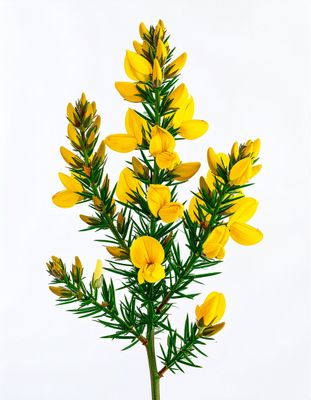
Everything about the color Daffodil
The meaning of the color daffodil and color combinations to inspire your next creation.
Browse images in the color daffodil
What color is daffodil?
Daffodil is a bright, cheerful yellow that captures the essence of springtime blooms. This vibrant hue is often associated with joy and positivity.
What are similar colors to daffodil?
For variations within the same bright and lively spectrum as daffodil, consider:
- Yellow (#FFFF00) shares daffodil's bright and sunny disposition, offering a slightly more saturated and intense yellow tone.
- Canary Yellow (#FFEF00) is a lighter, more pastel version of daffodil, maintaining the same cheerful and uplifting qualities.
- Lemon Yellow (#FFF44F) is a softer, more muted yellow that still retains the freshness and vibrancy of daffodil.
What color goes with daffodil?
To complement daffodil's bright and lively tones, consider pairing it with:
- Sky Blue (#87CEEB) offers a calming, cool contrast that enhances daffodil's warmth.
- Lavender (#E6E6FA) adds a touch of elegance with its soothing, purple-tinged hue.
- Mint (#98FF98) provides a refreshing, green-tinged balance that pairs well with daffodil's brightness.
- Peach (#FFE5B4) matches with daffodil's warm, sunny tone and offers a gentle contrast.
What color conflicts with daffodil?
To avoid overwhelming the brightness of daffodil, consider avoiding:
- Black (#000000) can overpower the lightness of daffodil.
- Gray (#808080) could dull the vibrancy of daffodil.
- Brown (#A52A2A) may neutralize the intensity of daffodil.
- Dark Green (#006400) risks clashing with the bright, sunny nature of daffodil.
What does the color daffodil represent?
Daffodil represents renewal, new beginnings, and the joy of spring. It symbolizes hope and the promise of warmer days. Psychologically, daffodil can evoke feelings of happiness and optimism. It is often used to uplift spirits and inspire creativity. In art and design, daffodil is used to draw attention and add a pop of color, often symbolizing cheerfulness and vitality.
What's the history of daffodil?
The color daffodil takes its name from the daffodil flower, known for its bright yellow petals and association with spring. The flower's name is derived from the Latin word "asphodelus," which was adapted into the Old English "affodyle." In modern times, daffodil is used in fashion, design, and branding to convey a sense of freshness and energy, often associated with spring collections and cheerful themes.
Color Variations
Shades
Tints
Hues
Color Palettes
Monochromatic
Complementary
Analogous
Triadic
Tetradic
Images with daffodil color
Color Conversions
#FFFF31rgb(255, 255, 49)rgb(100%, 100%, 19%)0, 0, 81, 0hsl(60, 100%, 60%)60, 81, 100#FFFF3197, -21, 8878, 93, 1797, 90, 10311111111, 11111111, 00110001Color(red: 1, green: 1, blue: 0.19215686274509805)UIColor(red: 1, green: 1, blue: 0.19215686274509805, alpha: 1.0)Color(0xFFFFFF31)