Everything about the color Cerise
The meaning of the color cerise and color combinations to inspire your next creation.
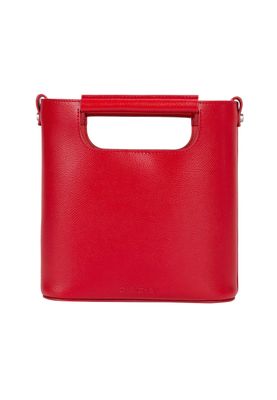
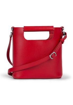
Browse images in the color cerise
What color is cerise?
Cerise is a vibrant, deep pinkish-red color, reminiscent of ripe cherries. It exudes energy and passion, making it a striking choice for bold designs.
What are similar colors to cerise?
For variations within the same vivid and lively spectrum as cerise, consider:
- Fuchsia (#FF00FF) shares cerise's bright, pinkish hue but with a more intense magenta tone.
- Magenta (#FF00FF) closely resembles cerise with its rich, purplish-red vibrancy.
- Crimson (#DC143C) offers a deeper, redder version of cerise, maintaining the same passionate intensity.
- Raspberry (#E30B5D) is a darker, more muted version of cerise, with a slightly more berry-like undertone.
What color goes with cerise?
To complement cerise's vibrant tones, consider pairing it with:
- Mint (#98FF98) offers a refreshing, cool contrast that balances cerise's intensity.
- Lavender (#E6E6FA) adds a soft, soothing touch to cerise's boldness.
- Teal (#008080) provides a deep, calming counterpoint to cerise's lively hue.
- Gold (#FFD700) enhances cerise's warmth with its rich, metallic glow.
What color conflicts with cerise?
To avoid clashing with cerise's vividness, consider avoiding:
- Black (#000000) can overshadow cerise's brightness.
- Gray (#808080) might dull cerise's vibrant energy.
- Beige (#F5F5DC) could neutralize cerise's lively impact.
- Cream (#FFFDD0) risks washing out cerise's boldness.
What does the color cerise represent?
Cerise represents passion, energy, and a sense of excitement. It is often associated with love and romance due to its rich, red-pink hue. Psychologically, cerise can evoke feelings of enthusiasm and confidence, making it a popular choice for attention-grabbing designs. In art and design, cerise adds a dynamic and bold element, often used to convey a sense of modernity and vibrancy.
What's the history of cerise?
The name "cerise" comes from the French word for cherry, reflecting its cherry-like hue. The color gained popularity in the 19th century, especially in fashion and textiles, for its striking and vibrant appearance. In modern times, cerise is used in various applications, from fashion to graphic design, to convey energy and boldness.
Color Variations
Shades
Tints
Hues
Color Palettes
Monochromatic
Complementary
Analogous
Triadic
Tetradic
Images with cerise color
Color Conversions
#DE3163rgb(222, 49, 99)rgb(87%, 19%, 39%)0, 78, 55, 13hsl(343, 72%, 53%)343, 78, 87#DE316350, 68, 1433, 19, 1450, 69, 1211011110, 00110001, 01100011Color(red: 0.8705882352941177, green: 0.19215686274509805, blue: 0.38823529411764707)UIColor(red: 0.8705882352941177, green: 0.19215686274509805, blue: 0.38823529411764707, alpha: 1.0)Color(0xFFDE3163)


