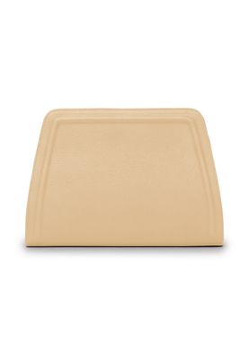
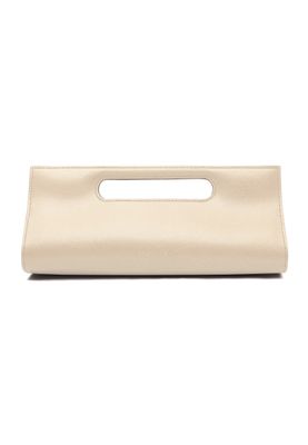
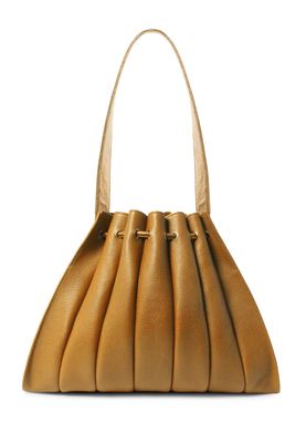
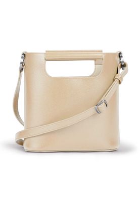
Everything about the color Papaya
The meaning of the color papaya and color combinations to inspire your next creation.
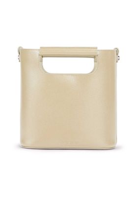
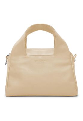
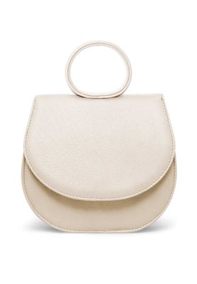
Browse images in the color papaya
What color is papaya?
Papaya is a warm, tropical shade that resembles the soft, creamy flesh of the fruit it is named after. It sits in the orange spectrum but is lighter and more muted, evoking a sense of warmth and relaxation.
What are similar colors to papaya?
For variations within the same warm and inviting spectrum as papaya, consider:
- Peach (#FFE5B4) shares papaya's warm, sunny tone with a slightly more pinkish hue.
- Apricot (#FBCEB1) is similar to papaya with its soft, orange-pink shade, offering a gentle, fruity vibe.
- Coral (#FF7F50) is a bolder, more vibrant version of papaya, with a stronger reddish undertone.
- Salmon (#FA8072) has a pinkish-orange tint that echoes papaya's warmth but with a brighter, more lively appearance.
What color goes with papaya?
To complement papaya's warm and tropical tones, consider pairing it with:
- Teal (#008080) provides a cool, refreshing contrast that enhances papaya's warmth.
- Lavender (#E6E6FA) adds a touch of elegance with its soothing, purple-tinged hue.
- Mint (#98FF98) offers a crisp, cool contrast that pairs well with the warmth of papaya.
- Ivory (#FFFFF0) complements papaya's softness with its gentle, neutral tone.
What color conflicts with papaya?
To avoid clashing with papaya's warm and inviting tones, consider avoiding:
- Black (#000000) can overpower the softness of papaya.
- Gray (#808080) could dull the vibrancy of papaya.
- Dark blue (#00008B) may create too stark a contrast with papaya's warmth.
- Charcoal (#36454F) risks overshadowing the lightness of papaya.
What does the color papaya represent?
Papaya represents warmth, tropical climates, and a sense of relaxation and leisure. It often evokes images of sunny beaches and exotic destinations. Psychologically, papaya can inspire feelings of comfort and happiness, making it a popular choice in designs that aim to create a welcoming atmosphere. In art and design, papaya is used to add a touch of warmth and softness, often balancing cooler tones or enhancing a tropical theme.
What's the history of papaya?
The color papaya is named after the tropical fruit known for its sweet, orange flesh. The fruit itself originates from Central America and has been cultivated for centuries. The color papaya has been used in design and fashion to evoke the warmth and vibrancy of tropical regions. In modern times, papaya is used in various design elements to create a warm, inviting atmosphere, often associated with relaxation and leisure.
Color Variations
Shades
Tints
Hues
Color Palettes
Monochromatic
Complementary
Analogous
Triadic
Tetradic
Images with papaya color
Color Conversions
#FFEFD5rgb(255, 239, 213)rgb(100%, 94%, 84%)0, 6, 16, 0hsl(37, 100%, 92%)37, 16, 100#FFEFD595, 1, 1584, 88, 7595, 15, 8511111111, 11101111, 11010101Color(red: 1, green: 0.9372549019607843, blue: 0.8352941176470589)UIColor(red: 1, green: 0.9372549019607843, blue: 0.8352941176470589, alpha: 1.0)Color(0xFFFFEFD5)
