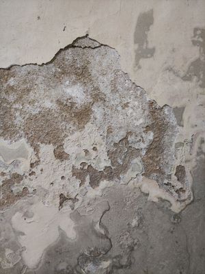
Everything about the color Neutral
The meaning of the color neutral and color combinations to inspire your next creation.
Browse images in the color neutral
What color is neutral?
Neutral is a balanced, understated shade that sits between black and white on the color spectrum. It often evokes a sense of calm and simplicity.
What are similar colors to neutral?
For variations within the same understated and versatile spectrum as neutral, consider:
- Gray (#808080) shares neutral's balanced tone but is slightly darker, offering a more defined presence.
- Taupe (#483C32) is similar to neutral with its earthy undertones, providing a warm, natural feel.
- Beige (#F5F5DC) is lighter than neutral, offering a softer, more subtle alternative.
- Greige (#BEBEBE) combines gray and beige, closely resembling neutral with a hint of warmth.
What color goes with neutral?
To complement neutral's understated tones, consider pairing it with:
- White (#FFFFFF) enhances neutral's simplicity with its crisp, clean contrast.
- Black (#000000) provides a striking contrast that highlights neutral's subtlety.
- Sage (#BCB88A) adds a touch of natural elegance with its muted green hue.
- Lavender (#E6E6FA) introduces a soft, calming contrast with its gentle purple tones.
- Mint (#98FF98) offers a refreshing, cool contrast that pairs well with neutral's understated nature.
What color conflicts with neutral?
To avoid clashing with neutral's balanced tones, consider avoiding:
- Bright Red (#FF0000) can overpower the subtlety of neutral.
- Neon (#39FF14) risks overwhelming neutral's calm presence with its intense brightness.
- Fuchsia (#FF00FF) may clash with neutral's understated nature due to its vivid intensity.
- Orange (#FFA500) could disrupt the tranquility of neutral with its vibrant energy.
What does the color neutral represent?
Neutral represents balance and simplicity, often symbolizing calmness and neutrality. It is associated with minimalism and timelessness. Psychologically, neutral can evoke feelings of stability and reliability, providing a sense of peace and relaxation. In art and design, neutral serves as a versatile backdrop, allowing other colors to stand out while maintaining a cohesive look. In photography and film, it is often used to create a serene and understated atmosphere.
What's the history of neutral?
The term "neutral" comes from the Latin word "neuter," meaning neither one nor the other, reflecting its balanced nature. Historically, neutral colors have been used in art and design for their versatility and ability to complement a wide range of palettes. In modern times, neutral has become a staple in minimalist and contemporary design, valued for its ability to create a harmonious and sophisticated environment.
Color Variations
Shades
Tints
Hues
Color Palettes
Monochromatic
Complementary
Analogous
Triadic
Tetradic
Images with neutral color
Color Conversions
#A9A9A9rgb(169, 169, 169)rgb(66%, 66%, 66%)0, 0, 0, 34hsl(0, 0%, 66%)0, 0, 66#A9A9A969, 0, 038, 40, 4369, 0, 29710101001, 10101001, 10101001Color(red: 0.6627450980392157, green: 0.6627450980392157, blue: 0.6627450980392157)UIColor(red: 0.6627450980392157, green: 0.6627450980392157, blue: 0.6627450980392157, alpha: 1.0)Color(0xFFA9A9A9)


