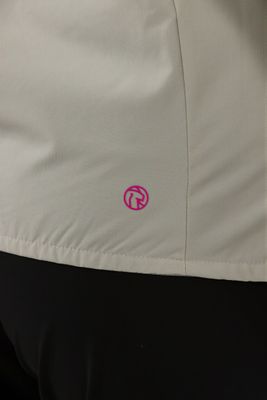
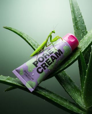
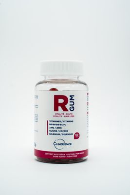
Everything about the color Hibiscus
The meaning of the color hibiscus and color combinations to inspire your next creation.
Browse images in the color hibiscus
What color is hibiscus?
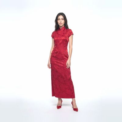
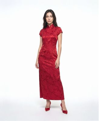
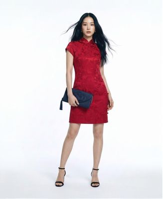
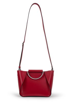
Hibiscus is a vibrant, medium-dark pinkish-red hue, reminiscent of the tropical flowers it is named after. It exudes energy and warmth, often associated with exotic and lively settings.
What are similar colors to hibiscus?
For variations within the same vibrant and lively spectrum as hibiscus, consider:
- Fuchsia (#FF00FF) shares hibiscus's vividness with a more intense pink tone, offering a playful and bold appearance.
- Magenta (#FF00FF) closely resembles hibiscus with its rich pink-red blend, evoking a sense of creativity and passion.
- Crimson (#DC143C) is a deeper red, providing a more dramatic and intense version of hibiscus's lively hue.
- Rose (#FF007F) offers a softer, more romantic version of hibiscus, maintaining its warm and inviting qualities.
What color goes with hibiscus?
To complement hibiscus's vibrant tones, consider pairing it with:
- Teal (#008080) provides a cool, refreshing contrast that enhances the warmth of hibiscus.
- Ivory (#FFFFF0) softens hibiscus's intensity with its gentle, neutral tone.
- Mint (#98FF98) adds a crisp, cool contrast that pairs well with the vibrancy of hibiscus.
- Lavender (#E6E6FA) introduces a soothing, elegant touch to balance hibiscus's boldness.
What color conflicts with hibiscus?
To avoid clashing with the vibrancy of hibiscus, consider avoiding:
- Black (#000000) can overpower the lively nature of hibiscus.
- Gray (#808080) might dull the vibrant energy of hibiscus.
- Beige (#F5F5DC) may neutralize the lively essence of hibiscus.
- Cream (#FFFDD0) risks washing out the intensity of hibiscus.
What does the color hibiscus represent?
Hibiscus often symbolizes exotic beauty, warmth, and the vibrancy of tropical environments. It is associated with passion and enthusiasm. Psychologically, hibiscus can evoke feelings of excitement and energy, often inspiring creativity and a sense of adventure. In art, photography, and design, hibiscus is used to create bold, eye-catching compositions that draw attention and convey a sense of liveliness and warmth.
What's the history of hibiscus?
The color hibiscus is named after the tropical hibiscus flower, known for its striking pink-red petals. This color has been associated with tropical climates and exotic beauty, often used in fashion and design to evoke a sense of warmth and vibrancy. In modern use, hibiscus is popular in branding and design, where it adds a lively and energetic touch to visual compositions.
Color Variations
Shades
Tints
Hues
Color Palettes
Monochromatic
Complementary
Analogous
Triadic
Tetradic
Images with hibiscus color
Color Conversions
#B6316Crgb(182, 49, 108)rgb(71%, 19%, 42%)0, 73, 41, 29hsl(333, 58%, 45%)333, 73, 71#B6316C43, 57, -323, 13, 1643, 57, 35710110110, 00110001, 01101100Color(red: 0.7137254901960784, green: 0.19215686274509805, blue: 0.4235294117647059)UIColor(red: 0.7137254901960784, green: 0.19215686274509805, blue: 0.4235294117647059, alpha: 1.0)Color(0xFFB6316C)