Everything about the color Butterscotch
The meaning of the color butterscotch and color combinations to inspire your next creation.
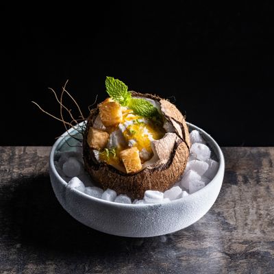
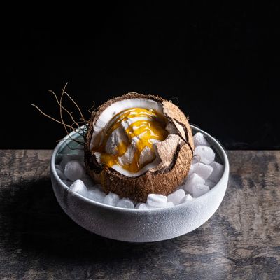
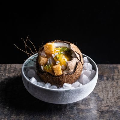
Browse images in the color butterscotch
What color is butterscotch?
Butterscotch is a warm, golden-yellow hue reminiscent of the rich, creamy confectionery treat. It exudes a sense of warmth and comfort, often associated with autumn and cozy settings.
What are similar colors to butterscotch?
For variations within the same warm and inviting spectrum as butterscotch, consider:
- Amber (#FFBF00) shares butterscotch's golden tones but with a slightly deeper and more intense hue.
- Gold (#FFD700) is brighter and more metallic, offering a luxurious and opulent feel.
- Mustard (#FFDB58) is a darker, more muted yellow, providing a more earthy and grounded look.
- Honey (#FFB300) is a softer, more subdued version of butterscotch, with a hint of sweetness.
What color goes with butterscotch?
To complement butterscotch's warm and inviting tones, consider pairing it with:
- Teal (#008080) provides a cool, contrasting balance that enhances butterscotch's warmth.
- Sage (#BCB88A) offers a soft, muted green that complements the golden hues of butterscotch.
- Lavender (#E6E6FA) adds a touch of elegance with its soothing, purple-tinged hue.
- Ivory (#FFFFF0) creates a classic and clean contrast, highlighting butterscotch's richness.
What color conflicts with butterscotch?
To avoid clashing with butterscotch's warm tones, consider avoiding:
- Bright Red (#FF0000) can overpower the subtlety of butterscotch.
- Neon Yellow (#FFFF33) risks overwhelming the warmth of butterscotch with its intense brightness.
- Black (#000000) can create too stark a contrast, overshadowing butterscotch's warmth.
- Gray (#808080) could dull the vibrancy of butterscotch.
What does the color butterscotch represent?
Butterscotch represents warmth, comfort, and nostalgia, often evoking memories of cozy autumn days and sweet treats. Psychologically, it is associated with optimism and cheerfulness, providing a sense of security and happiness. In art and design, butterscotch is used to create inviting and welcoming spaces, often paired with earthy tones for a grounded effect. In photography and film, it can be used to evoke a vintage or retro feel, adding a touch of nostalgia to the visual narrative.
What's the history of butterscotch?
The color butterscotch takes its name from the confectionery treat known for its rich, buttery flavor and golden hue. The term "butterscotch" originated in the 19th century, with the sweet becoming popular in England. The color has since been used to describe various shades of warm, golden-yellow tones reminiscent of the candy. In modern times, butterscotch is used in fashion, interior design, and branding to evoke warmth and nostalgia.
Color Variations
Shades
Tints
Hues
Color Palettes
Monochromatic
Complementary
Analogous
Triadic
Tetradic
Images with butterscotch color
Color Conversions
#DAA520rgb(218, 165, 32)rgb(85%, 65%, 13%)0, 24, 85, 15hsl(43, 74%, 49%)43, 85, 85#DAA52071, 9, 6943, 42, 771, 69, 8311011010, 10100101, 00100000Color(red: 0.8549019607843137, green: 0.6470588235294118, blue: 0.12549019607843137)UIColor(red: 0.8549019607843137, green: 0.6470588235294118, blue: 0.12549019607843137, alpha: 1.0)Color(0xFFDAA520)