Everything about the color Bordeaux
The meaning of the color bordeaux and color combinations to inspire your next creation.
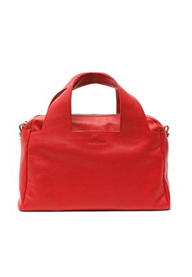
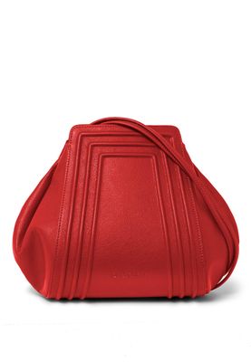
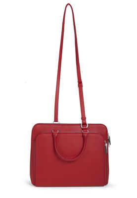
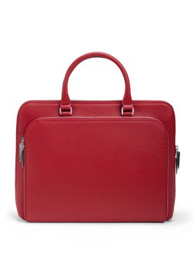
Browse images in the color bordeaux
What color is bordeaux?
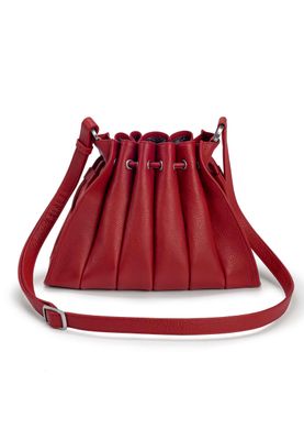
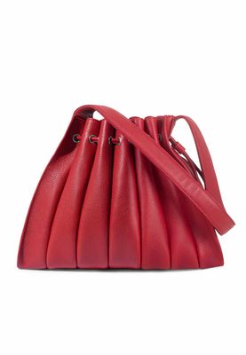
Bordeaux is a deep, rich shade of red with a hint of purple, reminiscent of the famous wine from the Bordeaux region in France. This color exudes sophistication and elegance, often associated with luxury and depth.
What are similar colors to bordeaux?
For variations within the same deep and rich spectrum as bordeaux, consider:
- Burgundy (#800020) shares bordeaux's deep red tone but with a slightly more purple undertone, offering a sophisticated and regal feel.
- Maroon (#800000) is similar to bordeaux but with a more brownish tint, providing a warm, earthy vibe.
- Wine (#722F37) closely resembles bordeaux with its blend of red and purple tones, evoking the luxurious essence of a fine red wine.
- Crimson (#DC143C) is brighter yet shares bordeaux's richness and depth, adding a more vibrant, energetic edge to the palette.
What color goes with bordeaux?
To complement bordeaux's luxurious tones, consider pairing it with:
- Ivory (#FFFFF0) provides a soft, neutral contrast that highlights the richness of bordeaux.
- Gold (#FFD700) adds a touch of opulence and warmth, enhancing bordeaux's regal qualities.
- Sage (#BCB88A) offers a refreshing, green-tinged balance that goes well with the boldness of bordeaux.
- Blush (#DE5D83) introduces a delicate, pinkish hue that softens bordeaux's intensity.
- Navy (#000080) provides a strong, dark contrast that complements bordeaux's depth and richness.
What color conflicts with bordeaux?
To avoid overwhelming the richness of bordeaux, consider avoiding:
- Black (#000000) can overpower the depth of bordeaux.
- Gray (#808080) could dull the vibrancy of bordeaux.
- Beige (#F5F5DC) may neutralize the intensity of bordeaux.
- Cream (#FFFDD0) risks washing out the intensity of bordeaux.
- White (#FFFFFF) risks washing out the intensity of bordeaux.
What does the color bordeaux represent?
Bordeaux symbolizes luxury, sophistication, and elegance, often associated with fine wine and high-end fashion. Psychologically, it conveys a sense of power and ambition, while also suggesting warmth and comfort. In art and design, bordeaux is used to create a sense of depth and richness, often employed to evoke a classic, timeless aesthetic. Its deep, warm tones make it a popular choice for creating dramatic and inviting spaces.
What's the history of bordeaux?
The color bordeaux derives its name from the famous wine-producing region in France, known for its rich red wines. The term has been used to describe this deep red hue since the late 19th century, reflecting the luxurious and refined qualities associated with the region's wines. Bordeaux has been a staple in fashion and interior design, symbolizing elegance and sophistication. In modern times, bordeaux continues to be a popular choice for those seeking a classic and timeless color that exudes warmth and richness.
Color Variations
Shades
Tints
Hues
Color Palettes
Monochromatic
Complementary
Analogous
Triadic
Tetradic
Images with bordeaux color
Color Conversions
#7B1F1Frgb(123, 31, 31)rgb(48%, 12%, 12%)0, 75, 75, 52hsl(0, 60%, 30%)0, 75, 48#7B1F1F28, 39, 249, 5, 228, 46, 3101111011, 00011111, 00011111Color(red: 0.4823529411764706, green: 0.12156862745098039, blue: 0.12156862745098039)UIColor(red: 0.4823529411764706, green: 0.12156862745098039, blue: 0.12156862745098039, alpha: 1.0)Color(0xFF7B1F1F)